
By Catherine Austin Fitts
My “go to” website for technical analysis of precious metals, the US dollar & the US stock market is Rambus Chartology, where Rambus (that’s his handle – he’s the founding technical analyst) leads a discussion with extensive charts of what the markets are saying.
Our series with Rambus began in October 2015 when the Solari Report did a written interview with Rambus including an introduction here and a discussion of Rambus, his background, technical analysis as well as the word “Chartology.” You can find all this information at our first interview:
- Why “Rambus?”
- How Rambus Chartology Got Started
- What Rambus Chartology Does
- About Technical Analysis
- Tracking the Markets
- What does the word “Chartology” mean?
In January 2016, Rambus launched his quarterly Solari Report with a Blockbuster Chartology. You can find links to the entire series of quarterly and annual Blockbuster Chartologies at the end this latest piece.
One of the reasons that Rambus is so good at his craft is that he focuses on “staying on the right side of the major trend.” The challenge of doing so at this time is that it is tempting to look for bottoms or to assume that the trend upwards in the US dollar or stock market may be over. However, Rambus consistently brings us back to the discipline of the Chartology. What does price tell us? As he describes so aptly, we are dealing with psychological warfare.
Sitting back once each quarter to get this perspective offers invaluable insight. So, here we go for the 1st Quarter 2018 Blockbuster Chartology!!
Blockbuster Chartology Quarterly Report
By Rambus
~ 1st Quarter 2018 Wrap Up ~
- World of Stocks : Big Picture
- Commodities
- Odds and Ends (US Dollar, Bonds and Gold)
- Post Script – SPX and GOLD Combo Chart
Part 1: World of Stocks – Big Picture
For several years now I’ve been doing a Quarterly Report for Catherine Austin Fitts who founded the Solari Report which is a financial / health style website. I try to cover most of the different areas of the markets by looking at the big picture using long term monthly charts for the most part. By doing the Quarterly Report it gives me a chance to keep abreast of what the long term charts are suggesting, which is most important to understand.
Currently if one is just focused in on the short term daily charts the volatility over the last three months seems extreme which it has been. It’s easy to get caught up in the short term swings which eventually will take most investors to the woodshed as they try to figure out the markets next move. Getting a position to stick when volatility has been this high is one of the hardest parts of trading. It’s almost impossible to place a sell/stop which can be very frustrating because the extreme volatility can take you out of the trade just as things turn around.
For the last two years we enjoyed a very low volatile rally which made it fairly easy to stick with your trades, but that all changed towards the end of January of this year. Markets have to correct at some point which is what they are doing now. After a strong impulse move like we’ve had over the last two years the markets can correct in two ways. First they can correct in price with a very large decline to shake out the weak hands. The second way the markets can correct is time. They can start to chop out a sideways trading range where the bulls and the bears fight it out for dominance until one side wins out. If the trading range builds out during a bull market the bulls will eventually win as they’re the dominant force and just the opposite in a bear market. A sideways trading range can last many months or even years depending on what time frame one is looking at.
The job of these corrections is to sow as much doubt in both the bulls and the bears as each camp thinks they are right. At the bottom of the trading range the bulls become embolden and rally the stock back up toward the previous high. As the bears believe the stocks are in a bear market they begin to sell into the strength and reverse the stock back down once again. This can happen many times during the course of a correction.
If the new trading range is going to be a consolidation pattern we’ll need to see an even number of reversal points at a minimum, four, six, eight or more. During a bull market the last trading range will be a reversal pattern which will have an odd number of reversal points such as three, five, seven or more. Until there is confirmation one way or the other the dominate trend leading into the new trading range takes precedence, the trend is your friend.
In part one of this Quarterly Report I’m going to start out by looking at some of the US stock markets and then some different world stock markets to see if they’re are showing us any signs that the bull market that started in 2009 is coming to an end. Keep in mind these are long term charts and do not reflect the volatility you see on a short term daily chart. Most of these charts also have very large bases or consolidation patterns which is needed for a long term bull market to play out. Small consolidation patterns lead to small moves while big consolidation patterns lead to big moves, depending on what time frame one is using.
I’ve added a 12 month simple moving average to the charts which can be a good gauge to let you know if the bull market is healthy or if problems are starting to arise if the stock begins trading beneath that important 12 month ma. It’s not the end of the world if a stock trades below its 12 month ma, but it does tell you to start paying close attention to the price action as it can be a warning sign the stock is getting tired.
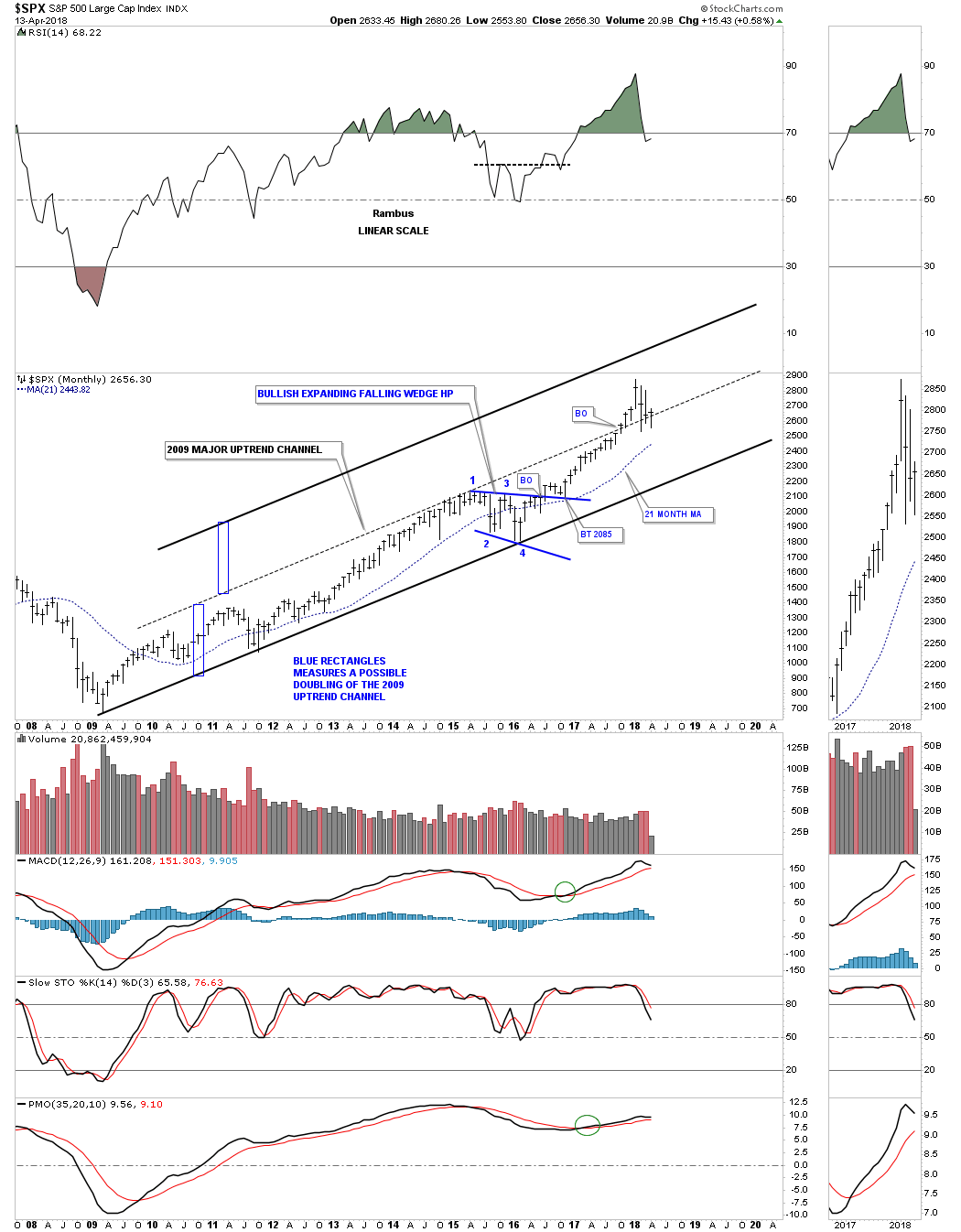
Lets start by looking at a ten year monthly chart for the SPX which shows its 2009 bull market uptrend channel. Please pay careful attention to the 12 month simple moving average which shows up on the chart and the zoomed in thumbnail on the side bar. When we begin to see a lot of stocks failing at their 12 month ma we will know the bull market is getting tired. On the other hand as long as most of the stocks are trading above their 12 month ma the markets are healthy.
Note the blue four point bullish expanding falling wedge that formed in 2015 which was needed to consolidate the previous strong impulse leg up that began in 2011. Since the SPX has been rallying for two years it may be time for the next consolidation phase to start building out. For whatever reason, the 21 month simple moving average for the SPX works out extremely well for buy and sell signals, so this is the only index I use this moving average on, all the other stock will have their 12 month moving average.
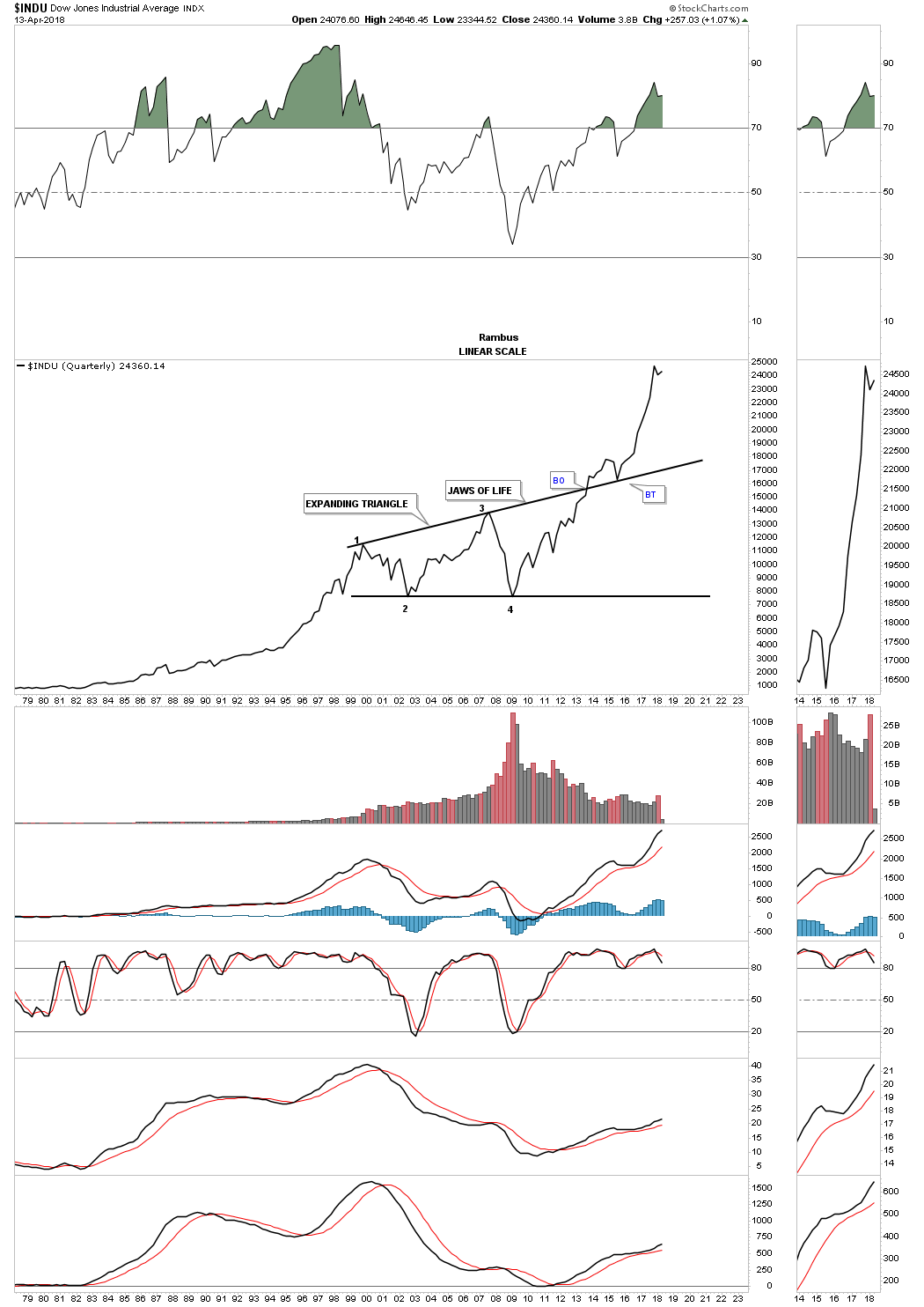
Below is a 25 year monthly chart for the SPX which shows its 13 year flat top expanding triangle consolidation pattern. Remember a big consolidation pattern leads to a big move and a small consolidation pattern leads to a small move.
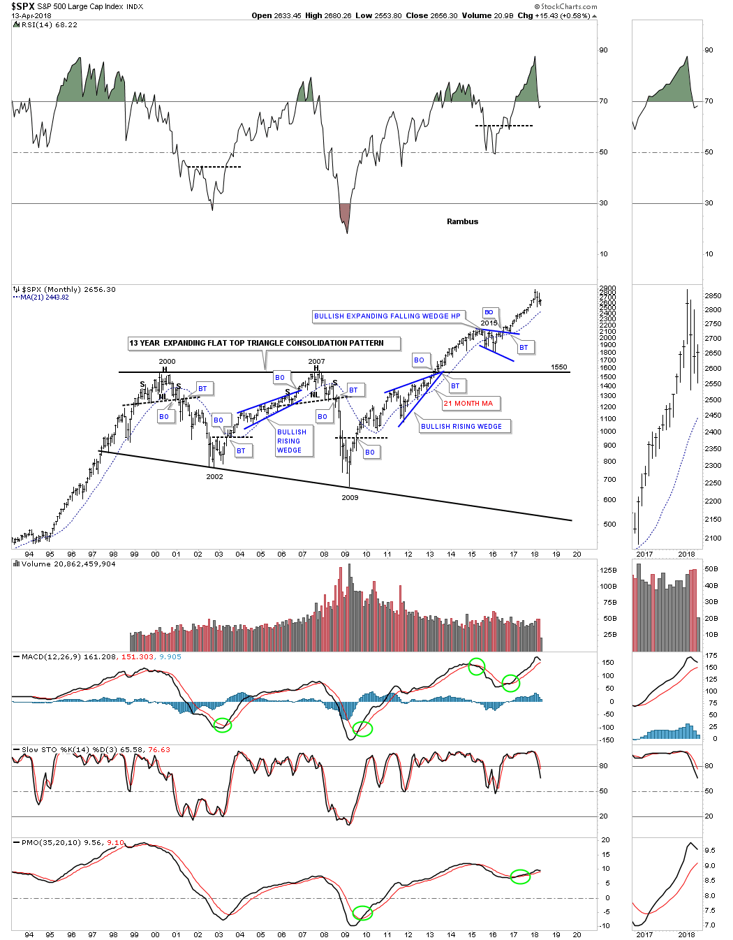
The 75 year quarterly chart for the SPX shows you a good example of how a big consolidation pattern can lead to a big move. From the mid 1960’s to the early 1980’s the SPX built out a massive bullish rising wedge. After that impulse move was exhausted at the 1987 high the SPX went on to form an eight year bullish rising wedge which had enough energy to carry the SPX up to its secular bull market high in 2000. It then took 13 years to consolidate that previous secular bull market when the SPX finally broke out from its 13 year flat top expanding triangle in 2013.

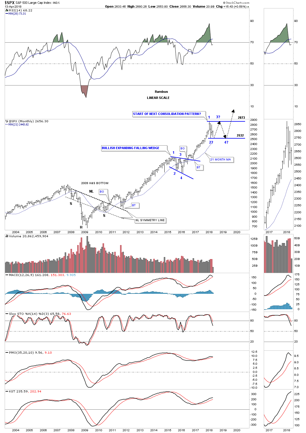
It’s still to early to know if the SPX is going to build out a large consolidation pattern to consolidate this last impulse leg up. If it does this monthly chart may show where the recent price action could build out the next consolidation pattern which could be a triangle, bull flag, or several other types of consolidation patterns. The rectangle is only one type of pattern. Whatever type of consolidation pattern builds out it will need to have at least four reversal points at a minimum.
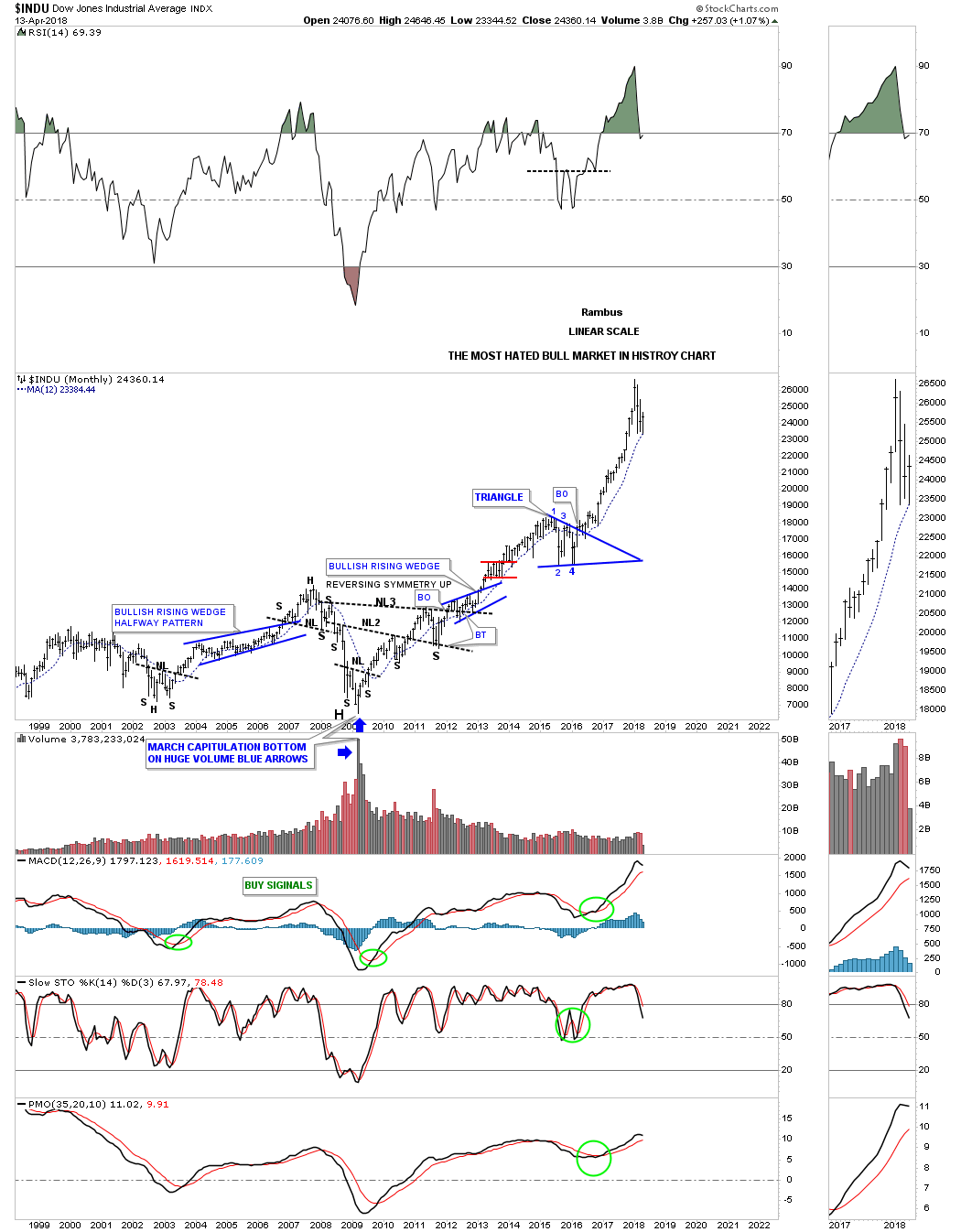
This first chart for the INDU I call the most hated bull market in history chart. As you can see this month the 12 month ma was touched and we are getting a bounce in price.
Similar to the big 13 year H&S consolidation pattern the SPX built out, the INDU built out the infamous “JAWS OF LIFE” consolidation pattern. It took what seemed like an eternity for the breaking out and backtesting process to finally complete after the blue triangle formed on the top rail.
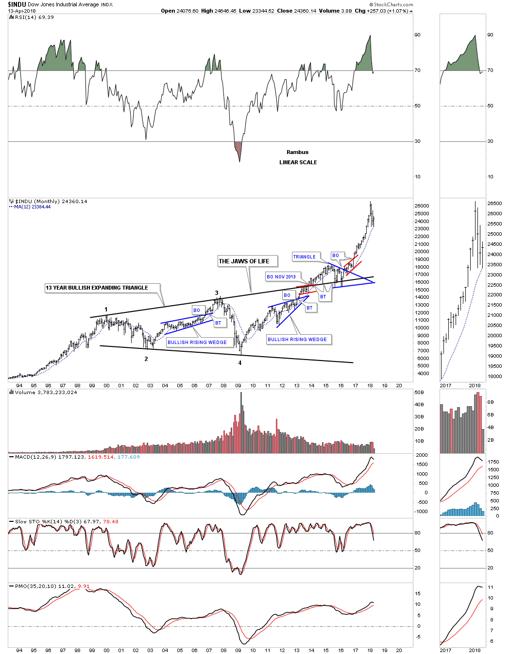
The monthly line chart shows a little cleaner JAWS OF LIFE pattern with the three backtests finding support on the top rail.
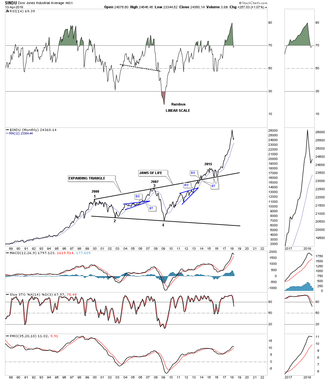
Below is a quarterly line chart which shows you just how strong the impulse move out of the Jaws of Life patterns has been. Since the middle of 2015 to the first quarter of this year the INDU didn’t have one down quarter. You can see the little hook at the top of the chart which was the January to March quarter of this year.
The 75 year quarterly chart for the INDU looks very similar to the 75 year quarterly chart we looked at on the SPX. Note how similar the breakout and backtest look on both the 1970’s H&S consolidation pattern and the Jaws of Life. Keep in mind we were following the Jaws of Life well before it finally broke out. Once the price action started to accelerate away from the top rail did I finally feel vindicated.
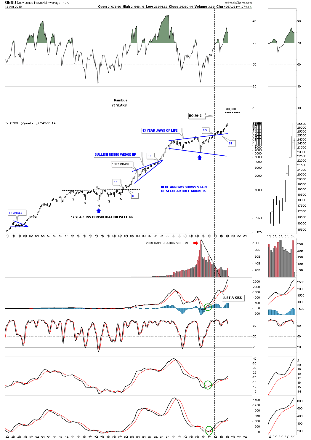
Note how well the 12 month ma has held support for the Transportation Average during the massive H&S consolidation pattern, with the head forming at the 2009 crash low, which launched this last bull market.
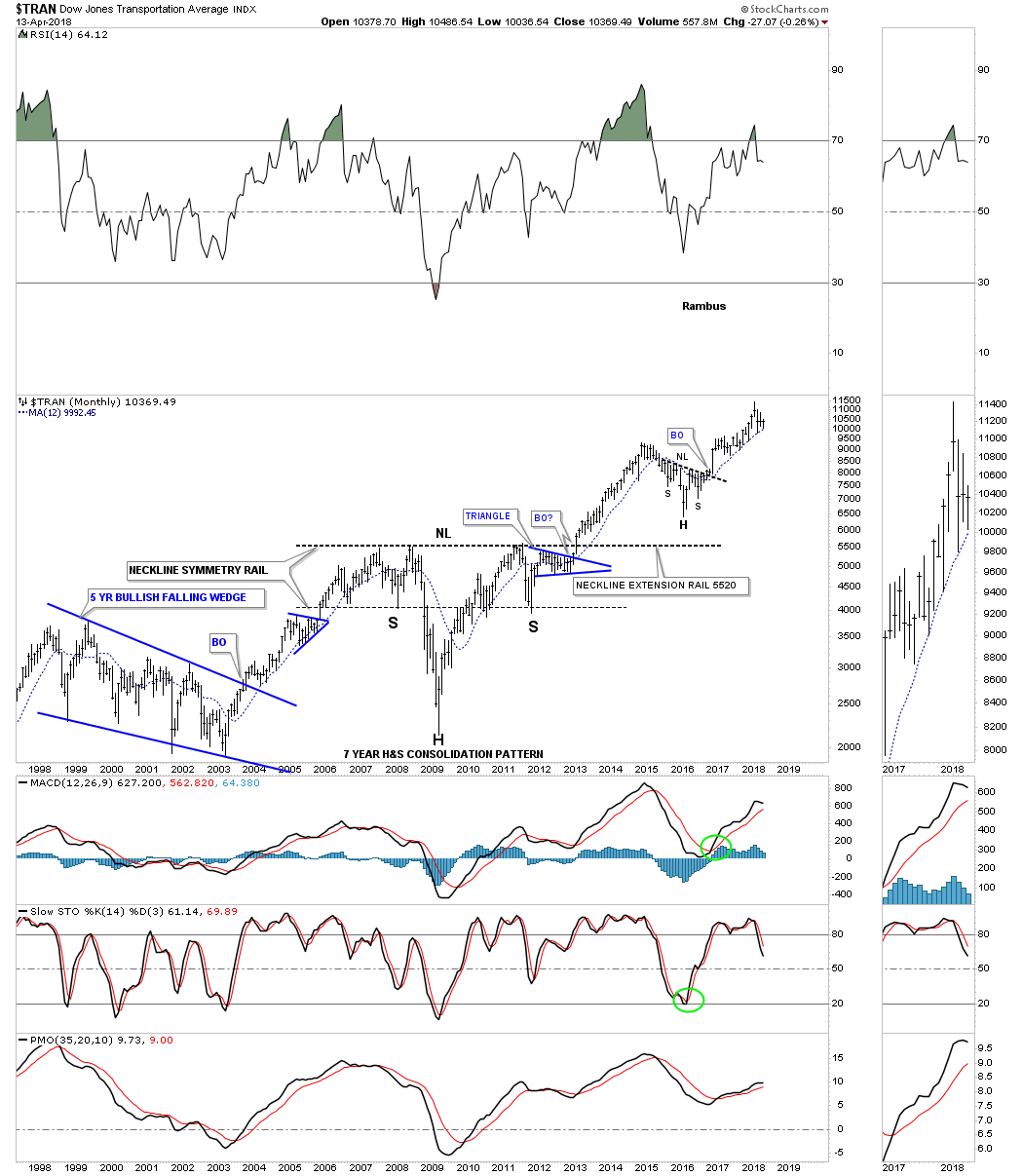
The 100 year quarterly chart for the Transportation Average shows how the 2009 H&S consolidation pattern fits into the big picture. The Transportation Average formed a classic 30 year bullish expanding rising wedge from 1955 to 1985. Note the small pause just before the breakout of the top rail, which is classic price action before an important trendline is broken and then the clean backtest to confirm the 30 year trading range.
![]()
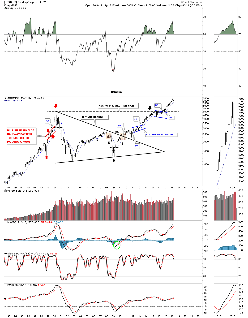
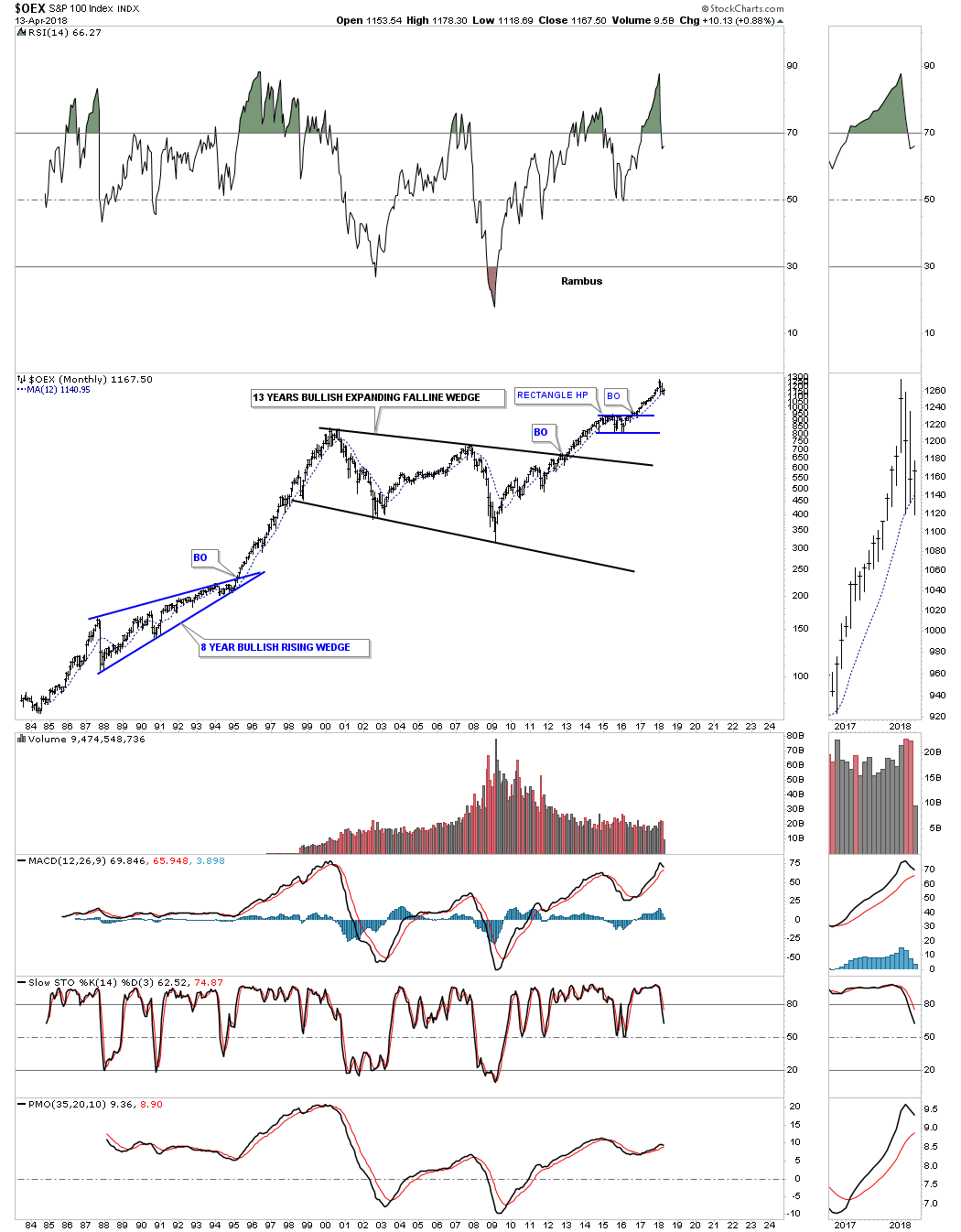
I’m not going to spend a lot of time explaining the rest of these US stock market indexes as the charts are pretty self explanatory. Just note the massive consolidation patterns which launched our current bull market, along with the 12 month moving averages that have been acting as support.
COMPQ:
OEX 100:
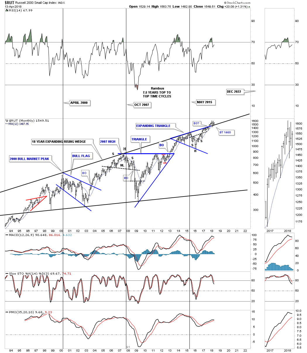
Below is the RUT 2000 small cap index which is currently breaking out and is in backtest mode to the top rail of the 18 year bullish expanding rising wedge. Note the H&S bottom inside the blue expanding triangle that suggested that the top rail would eventually be broken to the upside. This is another stock we’ve been watching for a long time, well before the current breakout, that has tested our patience. That top rail has been in place for 18 years and the bears didn’t want to give it up. All the work looks to be completing, which is why the small caps are one of the stronger sectors right now. One has a very clear line in the sand, above the top rail is bullish and below is bearish. Note the 12 month moving average.
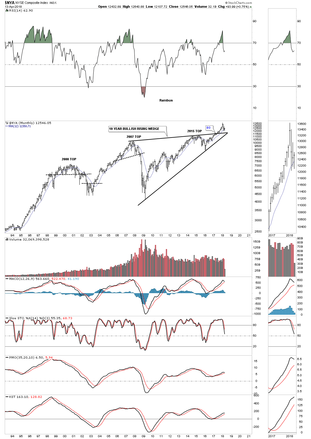
The NYA has been building out a 10 year bullish rising wedge with a breakout and backtest currently underway.
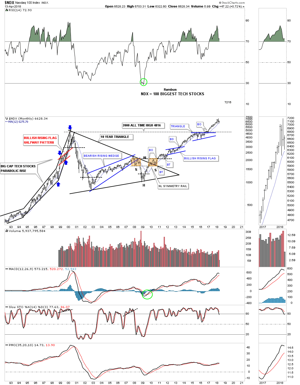
The last US stock market index we’ll look at is the NDX 100 which is made up of 100 of the biggest tech stocks. This chart shows some of the finest Chartology you’ll find anywhere.
Now that we’ve looked at some of the US stock markets lets take a look at some the world stock markets to see how they compare. Again, what I like to see are big consolidation patterns using a 21 month moving average to show the health of a market. Sometimes we don’t get everything we want to make a trade so you have to make a decision based on what the chart gives you.
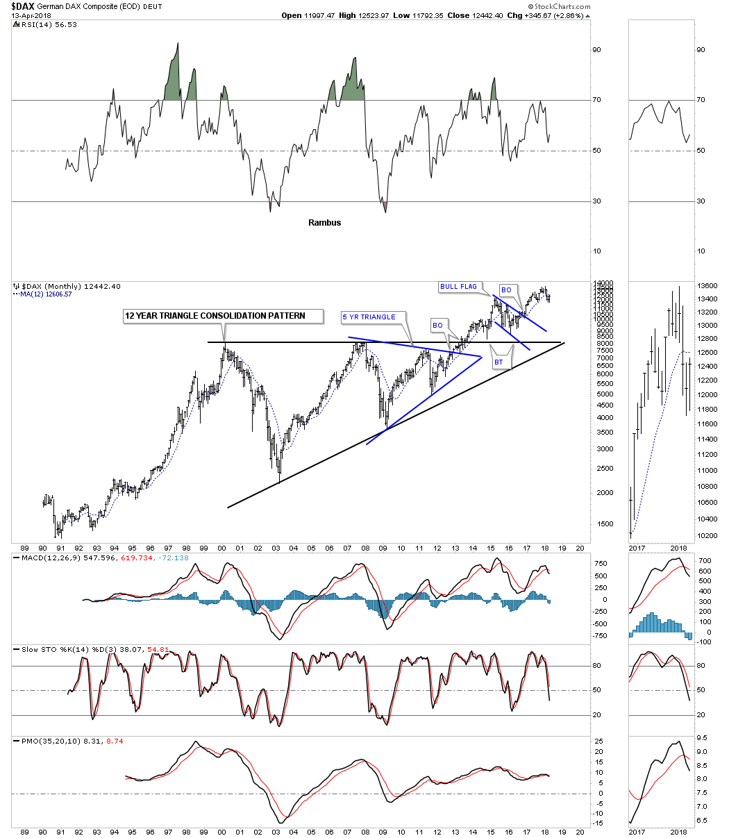
The DAX, German stock market, which is one of the more important stock markets, built out a 12 year triangle consolidation pattern. There was also a blue five year triangle which built out toward the apex. Once the blue triangle broke out above the top rail the odds were high that the 12 year triangle would also breakout. Currently the price action is struggling with the 12 month ma as it’s trading slightly below that important moving average. It’s not the end of the world yet for the DAX, but it does need to recapture the 12 month ma to turn positive again. There is a negative divergence on the RSI which also needs to be corrected.
The CAC, French stock market, is in the process of breaking out and backtesting the top rail of its 17 year triangle trading range. The 12 month ma is trying to provide some support. Since the 2008 low the CAC has made a series of higher highs and higher lows which is bullish.

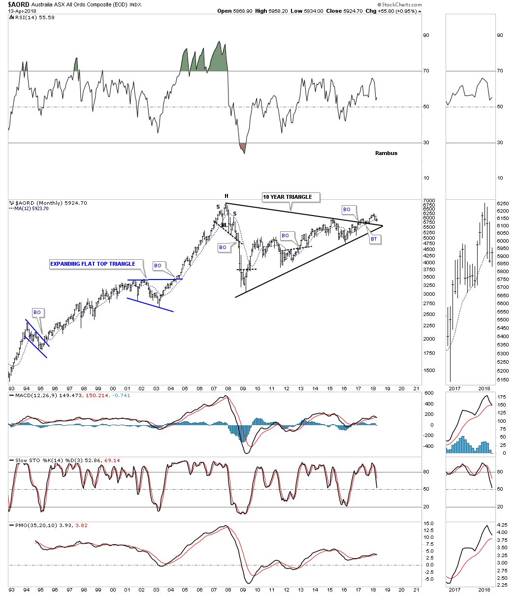
Next is the AORD, Australian stock market, which is attempting to breakout and backtest the top rail of its ten year triangle trading range. It’s important that the apex of the triangle holds support along with the 12 month moving average.
The 25 year monthly chart for the TSX, Canadian stock market, is still in the process of building a ten year rising wedge formation. At this point it has completed the needed four reversal points so far to make this trading range a consolidation pattern. If the price action doesn’t take out the top rail and reverses back down and touches the bottom rail that would complete the 5th reversal point, which would then make this trading range a reversal pattern if the bottom rail is broken to the downside. The price action is currently trading below the 12 month moving average so we wait for more clues.

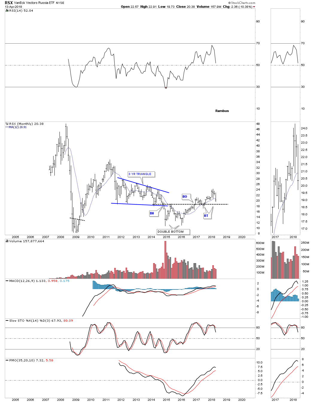
The RSX, Russian stock market, doesn’t have a lot of history on it, but it has been one of the weaker stock markets I’ve seen. It’s in the process of backtesting the double bottom trendline for the second time and is trading just below its 12 month moving average.
Next is the BVSP, Brazilian stock market, which is one of the stronger stock markets out there as it’s trading just below its all time highs after breaking out and backtesting the top rail of its ten year triangle consolidation pattern.

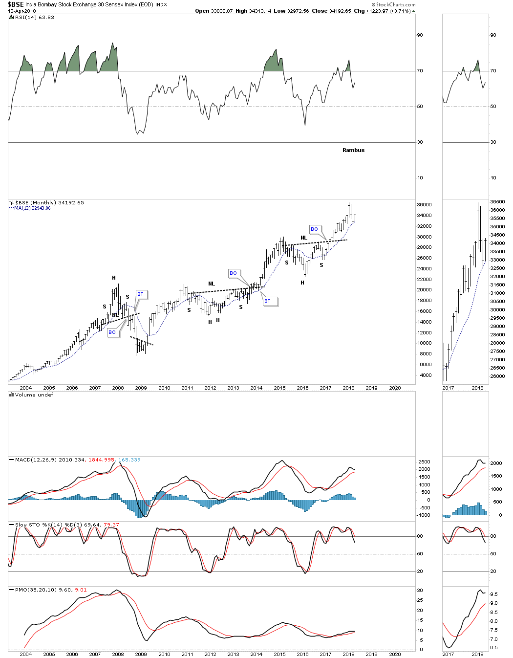
The BSE, India stock market, hasn’t built out a large consolidation pattern, but it has been in a very strong bull market since the 2008 low forming one H&S consolidation pattern on top of the previous one. It’s also finding support at its 12 month moving average.
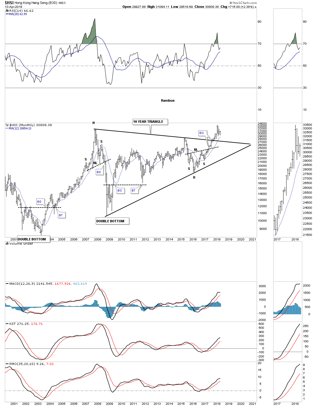
Some of the Asian stock markets have been performing much better than the European markets. The HSI, Hong Kong stock market, broke out of a 10 year triangle consolidation pattern about eight months ago after forming a H&S bottom at its last reversal point.
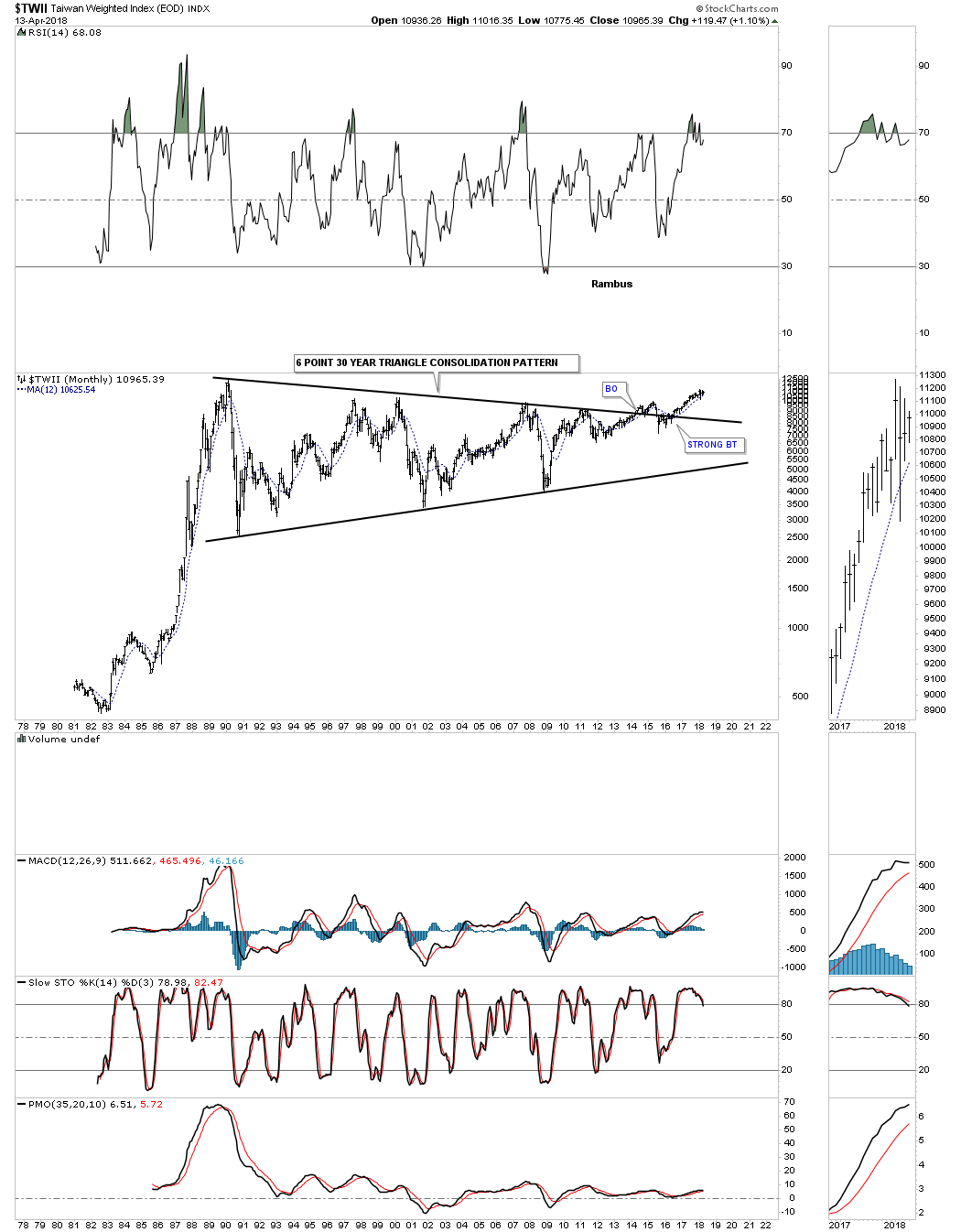
The TWII, Taiwan stock market, has built out one of the longest running consolidation patterns I’ve ever seen. It has built out a 30 year six point triangle consolidation pattern. The breakout actually came in 2013 along with many other stock markets we’ve looked at. The backtesting process has taken a long time to complete with the 12 month ma giving support.
The NIKK, Tokyo stock market, is setup much differently than most. It topped out in 1989 around 38,000 or so and then began a long term bear market that lasted 25 years. It finally bottomed out in 2008 by forming a five point triangle reversal pattern. The NIKK built out a H&S consolidation pattern just above the top rail of its 25 year downtrend channel and is in the process of backtesting the neckline and the 12 month moving average. From the mid 1970’s to the mid 1980’s the NIKK built out a ten year bullish rising wedge. This is a perfect example of what can happen when you spot one of these in a rising market. They are like any other consolidation pattern except it gives you a big clue that the trend is very strong.

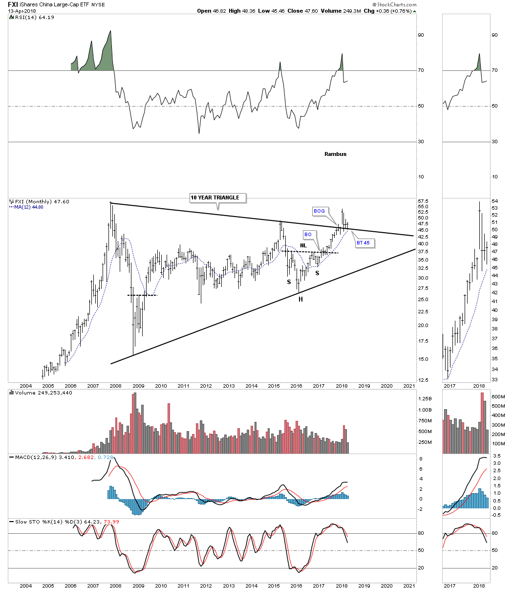
Below is the FXI, China large cap etf, which is in the process of breaking out and backtesting the top rail of its 10 year triangle consolidation pattern. The 12 month ma is reaching the top rail which should help offer some support on the backtest.
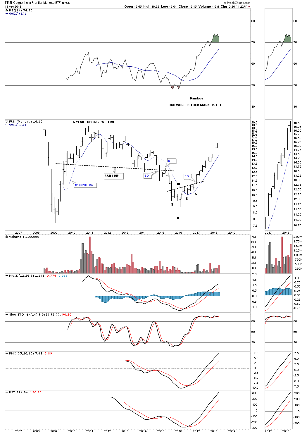
One of the biggest surprises has come from the FRN, Frontier stock market better know as a third world stock market etf. After breaking out from an unbalanced H&S bottom it hasn’t looked back.
A little less than a year ago the EEM, emerging markets etf, broke out from a ten year triangle consolidation pattern. I was looking for a backtest to the top rail, but it looks like the 12 month ma may prevent a complete backtest if it holds support.

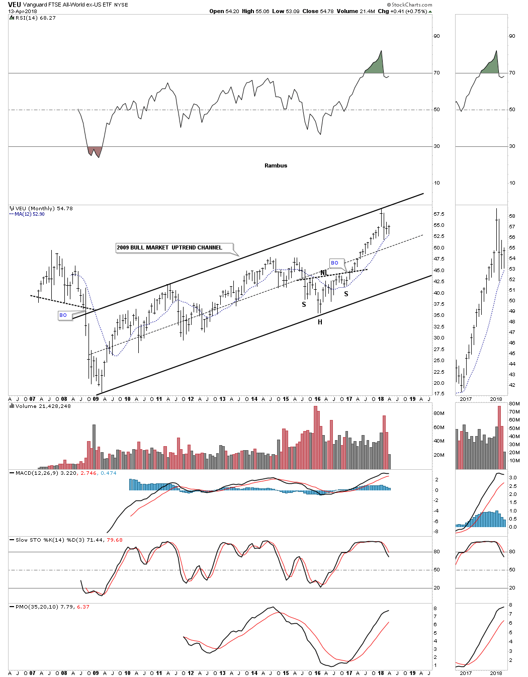
The last stock market index we’ll look at is the VEU, all world stock market ex the US stock market. This index is a good proxy for how the rest of the world as a whole is doing. As you can see it’s attempting to breakout from a seven year bullish rising flag formation with the 12 month ma giving some support on the backtest.
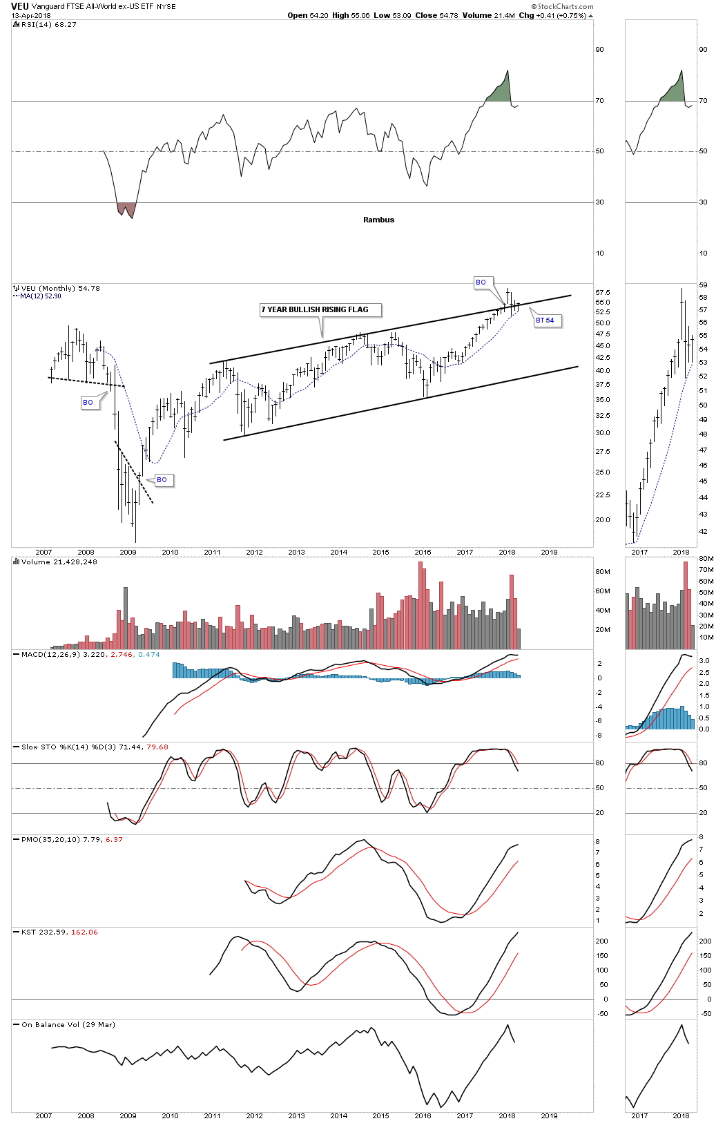
This long term monthly chart for the VEU shows the entire history for this etf which mostly consists of the 2009 bull market uptrend channel that so many other stock market indexes have built out.
For the most part the world stock markets are in pretty good shape with the European stock markets being a bit on the weaker side. In three months when we look at these charts again if we see many failing 12 month moving averages we’ll know the health of the world stock markets is deteriorating. For now the bull markets are alive and well IMHO.
In part 2 of this Quarterly Report we’ll look at some of the different areas of the markets, banks and housing along with some commodities. All the best…Rambus
Part 2: Commodities
In part two of this Quarterly Report we’ll look at the commodities complex as this sector has been trying to bottom over the last several years. It took a real hard hit during the 2008 crash and then again in 2014 when the US dollar had its big rally to the 100 area. Some areas within the commodities complex are doing a bit better than others, but it seems that most areas are at least bottoming. Again, we’ll look at the 12 month simple moving average for support.
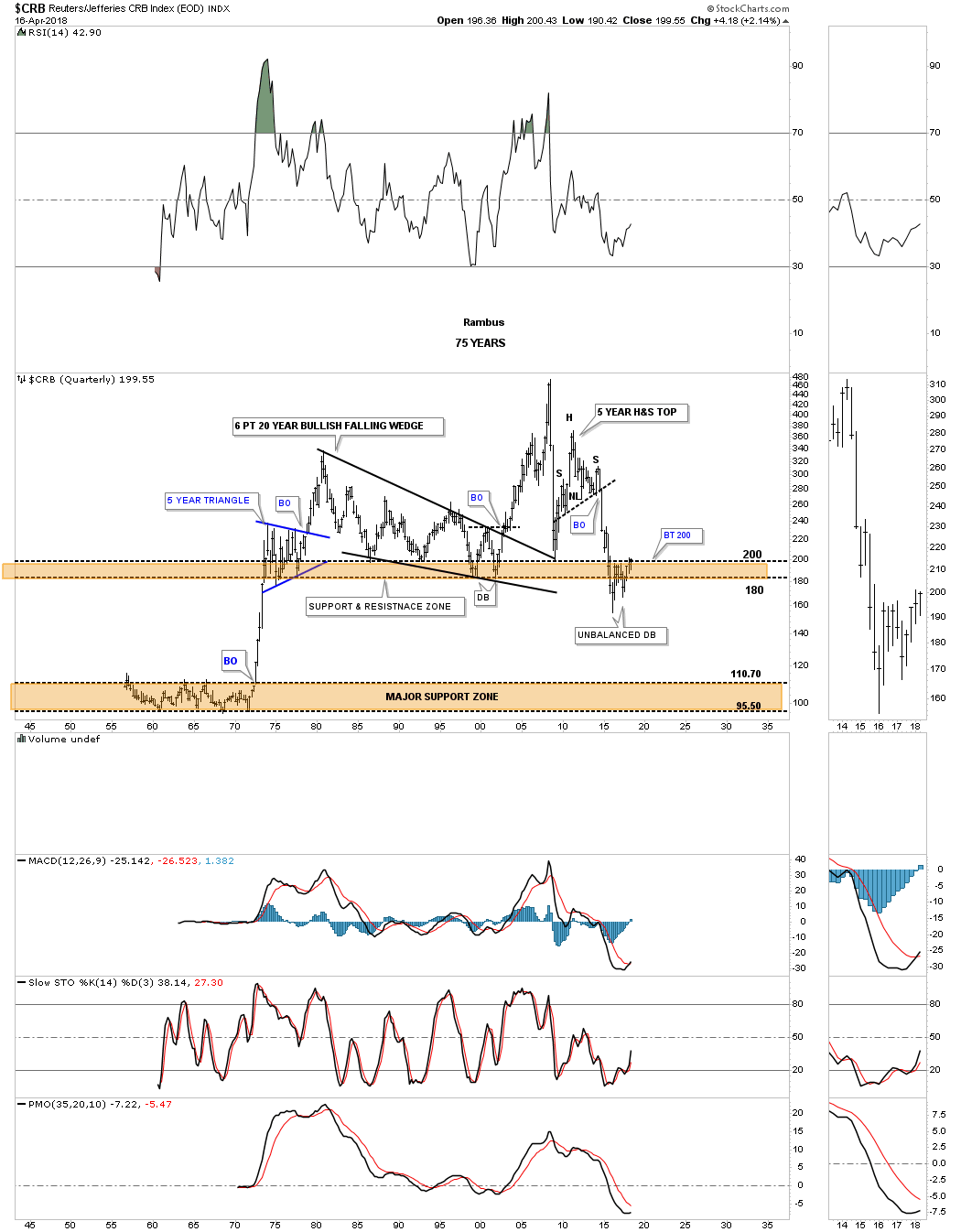
Lets start with the CRB index as it has been around the longest. The CRB index actually hit its low in early 2016 and had a decent bounce which topped out about a year later. It declined once again into the middle of 2017 which looked like it was going to test the previous low in 2016, but came up a little short to form a perfect double bottom.
Sometimes we don’t get a perfect chart pattern so we have to use our experience to try and figure out what is actually taking place. After such a large decline it pays to start looking for some type of reversal pattern to build out to reverse the downtrend. As the current price action is trading at lows not seen since the mid 1970’s this is a perfect area to look for a reversal pattern.
It’s not the prettiest double bottom I’ve ever seen, but it appears the CRB index is building out an unbalanced double bottom with the right low being slightly higher than the left low. A breakout above the double bottom trendline should complete the reversal pattern.
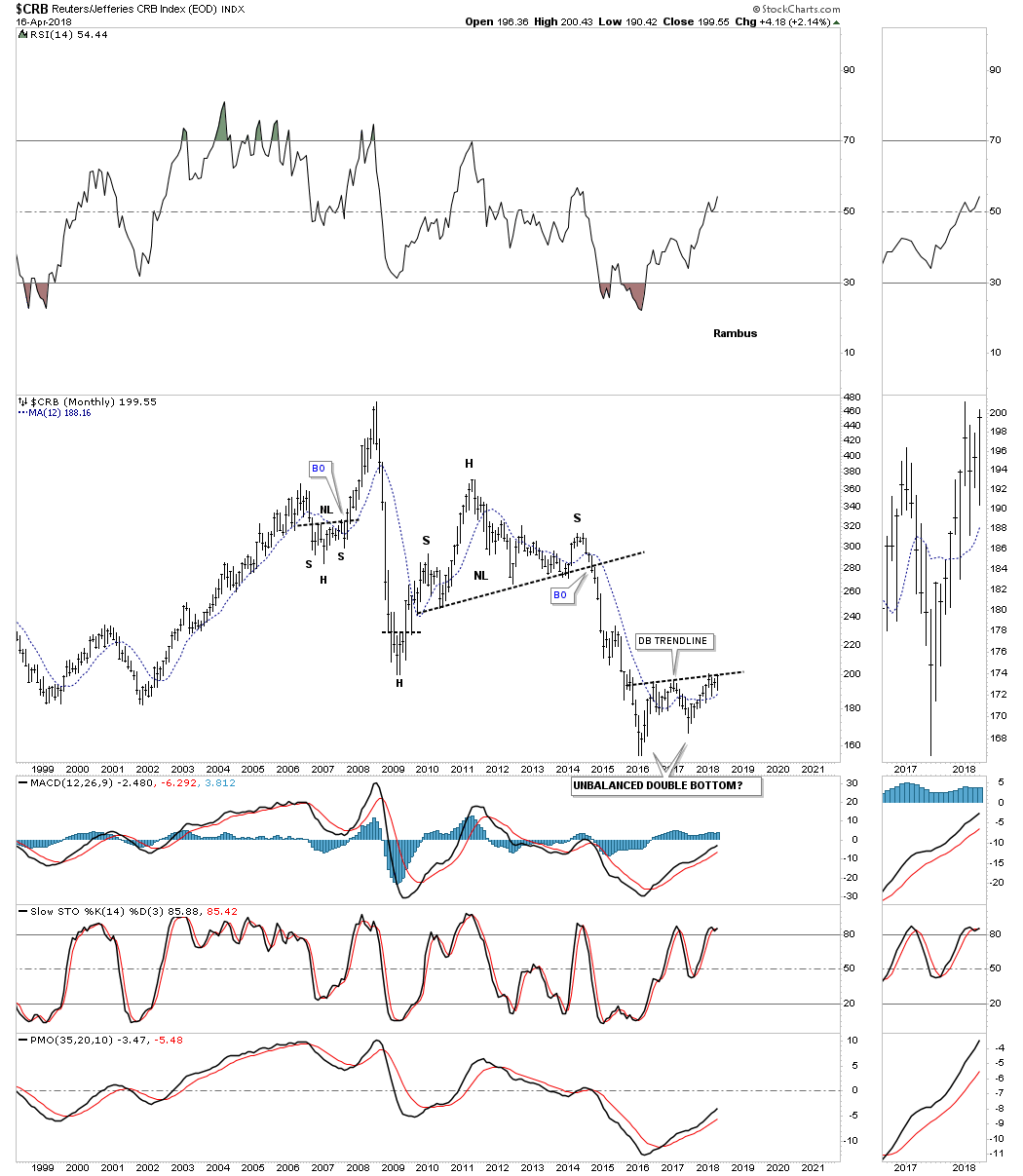
This quarterly chart puts the unbalanced double bottom in perspective. As you can see the unbalanced double bottom has formed just below the brown shaded support and resistance zone that stretches all the way back to the early 1970’s. During the initial penetration below the S&R zone the CRB index has rallied back up only to find resistance just below the top of the S&R zone where we got the second decline for the second low of the unbalanced double bottom. The double bottom trendline we looked at on the monthly chart above comes in at the top of the brown shaded S&R zone. A breakout above the double bottom trendline will also put the CRB index back above the brown shaded S&R zone which would be a bullish development. Keep a close eye on the 200 area.
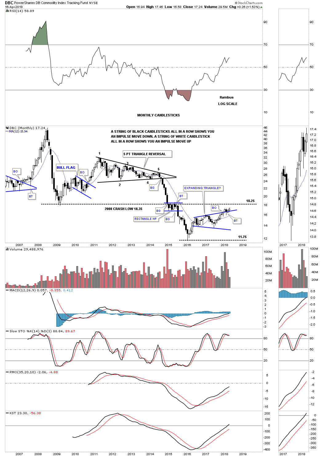
Next we’ll look at the DBC which is a more actively traded commodities index. First note the four year five point triangle reversal pattern which led to the crash that began in 2014. During the middle of that massive impulse leg down the price action formed a small rectangle halfway pattern just below the 2008 crash low, which we’ve discussed in the past would be a bearish situation in a bear market, just the opposite in a bull market.
I have to admit there isn’t what I would call a clear cut reversal pattern in place that is recognizable. What we do have though is a two year expanding triangle that is forming above the low which should make this pattern a bullish expanding triangle. We could see a second backtest to the top rail of the expanding triangle when the price action comes in contact with the 2008 crash low at 1825, as that line held resistance during the formation of that small rectangle halfway pattern that formed on the way down.
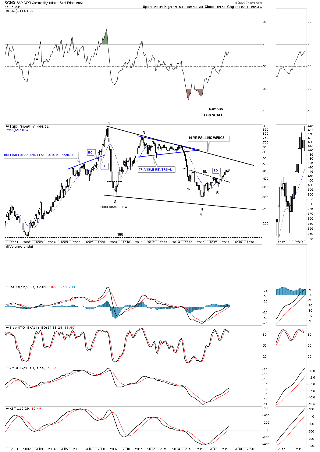
Below is another commodities index, GNX, which is still trading inside of a ten year falling wedge. The H&S bottom at the fourth reversal point is strongly suggesting there is enough energy for this index to make it back up to the top rail of the falling wedge. If the commodities bull market really gets its footing then the odds are high that we’ll see a breakout above the top rail.
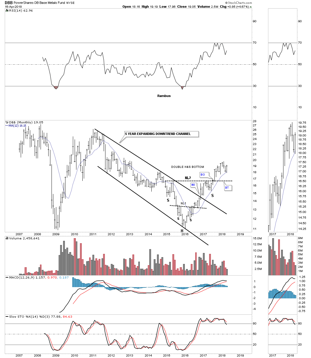
One of the strongest areas within the commodities complex is the DBB, base metals index, which has broken out from a double H&S bottom and is currently finding support on its 12 month ma. As you can see the DBB was locked into a five year slightly expanding downtrend channel before it finally broke out in late 2016. This chart shows one of those occasions that if you don’t take a position on the breakout you might not get another chance to get in because there was no backtest to the neckline. Sometimes you win and sometimes you lose. At any rate this chart does show some good confirmation the commodities complex is coming back to life.
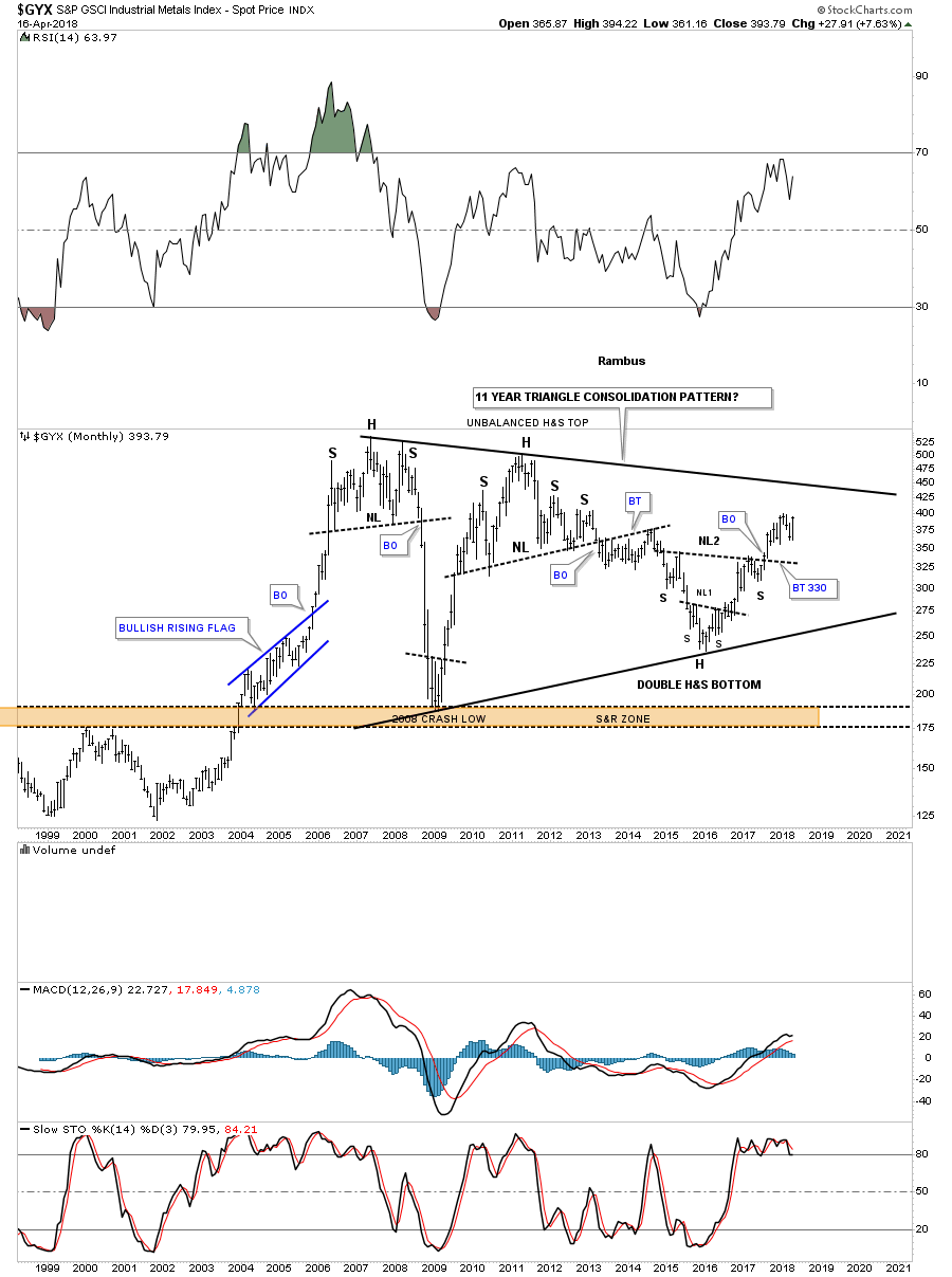
The GYX is an industrial metals index that is still trading inside of its massive 11 year triangle. What is becoming apparent when looking at a lot of the commodities indexes and other areas within this sector is there are a lot of H&S bottoms forming at the fourth reversal points in consolidation patterns or as the bottom itself.
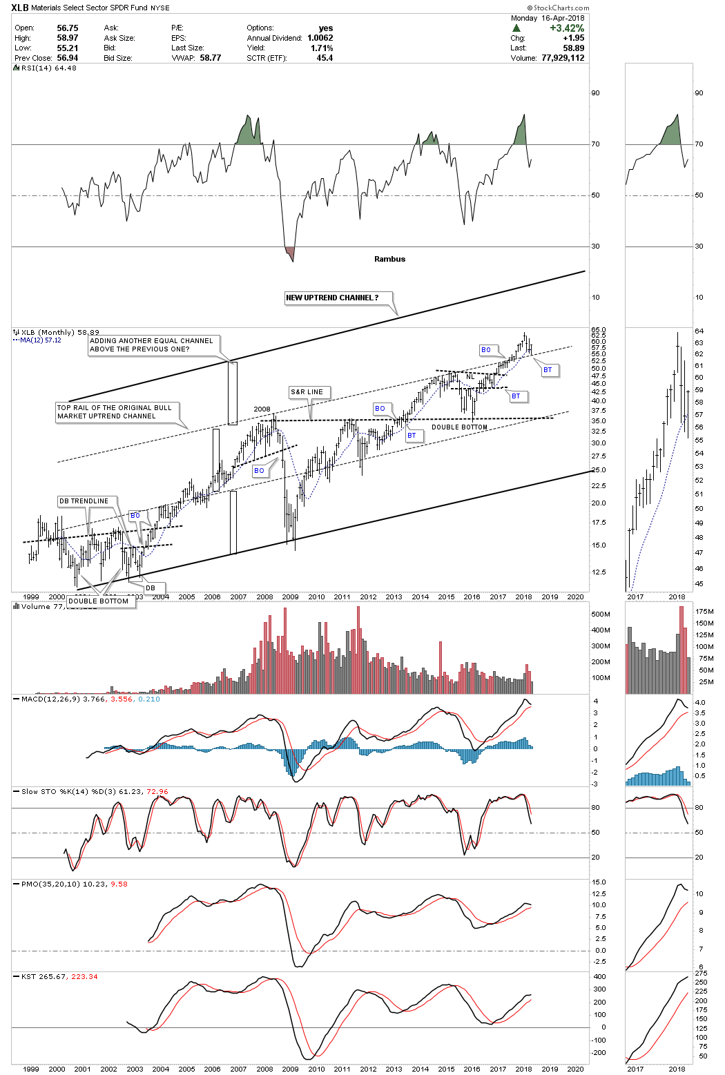
Lets look at an area that is related to the commodities complex, the basic materials sector. Keep in mind when you look at this index that there are a lot of stocks in the INDU which make up this sector which is why it looks so strong. In strong bull markets it’s not unusual for an uptrend to double in size. Sometimes they will form an equal channel above the previous one. The black rectangles are the exact same size and measures the height of the two lower channels.
As you can see the price action broke out above the upper dashed trendline back in 2017 and in currently backtesting that trendline from above. This is suggesting that we could see another equal channel build out above the upper dashed trendline similar in size to the previous two channels. The 12 month ma is helping hold support on the current backtest to the top dashed trendline.
Below is the IYM, basic materials etf, which broke out from a five year bullish rising flag formation and is currently backtesting the top rail with the 12 month ma helping with support.

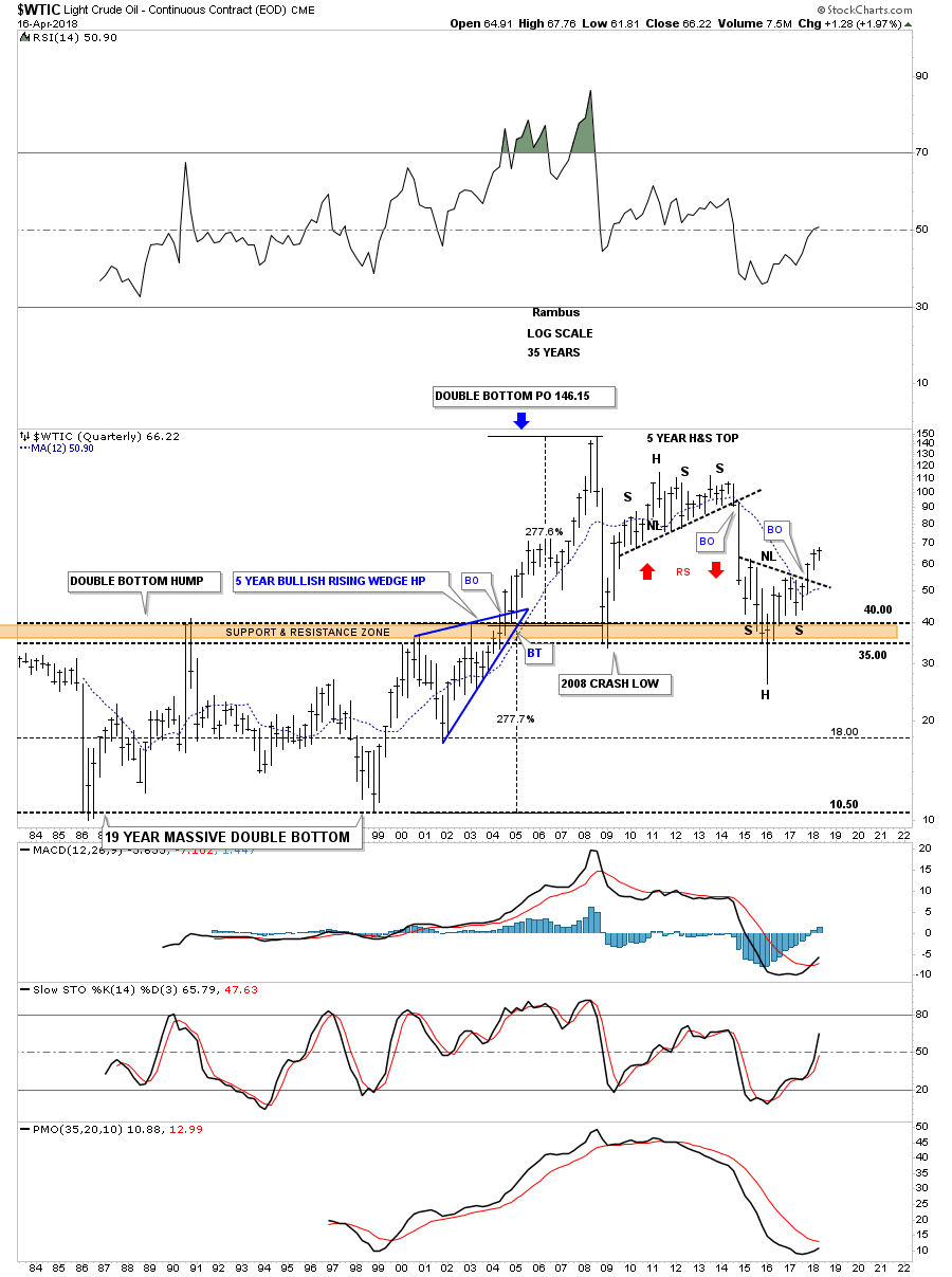
I mentioned earlier that we’re seeing many H&S bottoms forming, some inside big consolidation patterns and some are stand alone patterns. The WTIC, oil index, shows you a good example of a stand alone double H&S bottom.
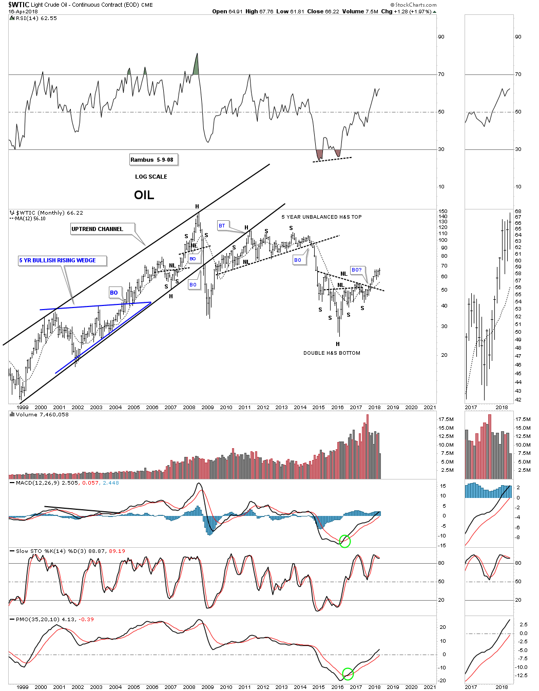
Previously we looked at the 75 year quarterly chart for the CRB index which showed the price action penetrating the brown shaded support and resistance zone. WTIC did the exact same thing strongly breaking below its brown shaded S&R zone. I can tell you it was pretty scary at the time as it looked like oil may crash all the way back down to its all time lows.
WTIC did turn around as the quarterly bar shows, leaving a long tail, which suggested oil had most likely put in its low. If you compare this chart to the 75 year quarterly chart we looked at earlier for the CRB index, I think this chart is telling us that the CRB index is putting in a long term low with its unbalanced double bottom that is getting ready to breakout.
Note that massive trading range below the brown shaded S&R zone which I’ve labeled as a double bottom. That distance added to the breakout above the brown shaded S&R zone back in 2004 and had a price objective up to the 146 area the same percentage move as the lower trading range. It took that multi year blue bullish rising wedge to give the WTIC the energy it needed to finally once and for all take out the brown shaded S&R zone which has now held support on two different occasions.
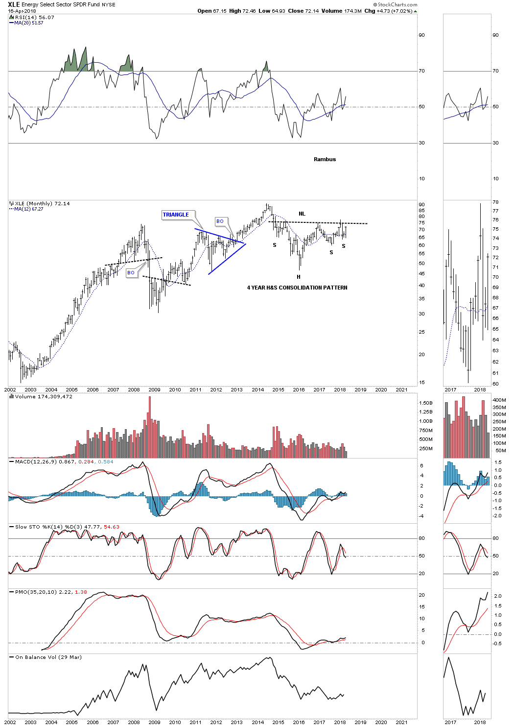
While we’re on oil lets take a quick look at the XLE, oil stocks etf, which is building out a four year H&S bottom. I did get shaken out of my original position when there was a false breakout above the little spike high you can see just above the right shoulder neckline. This chart is strongly suggesting that the oil stocks are finally going to have their day in the sun.
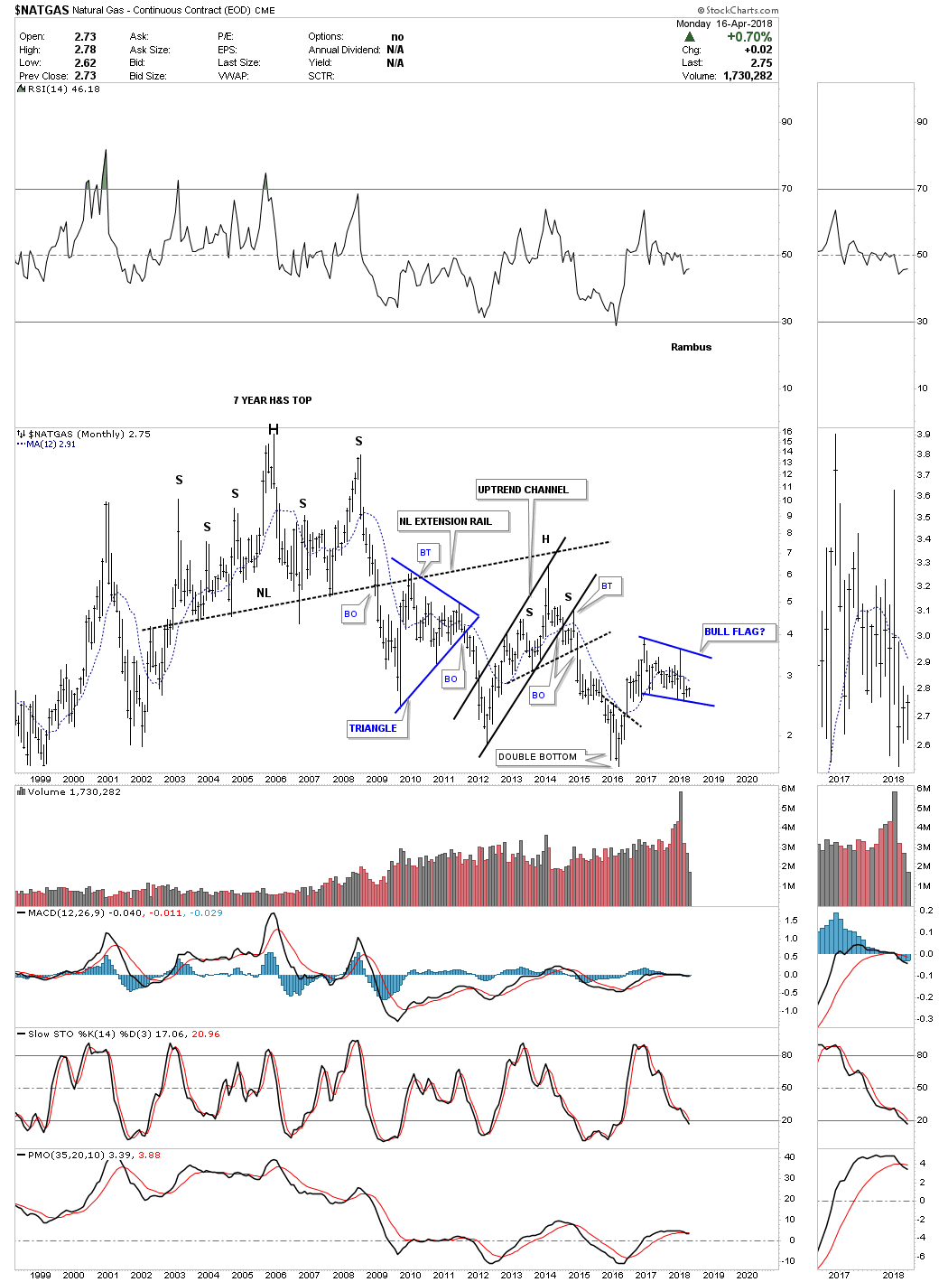
It might not look like it on this chart below, but trying to get a trade to stick has been almost impossible in natural gas. Below is the monthly chart for NATGAS which is trying to build out a bull flag. As with some of the other commodity indexes we looked at earlier that didn’t have a clear cut reversal pattern at the low, NATGAS formed just a small double bottom as its reversal pattern that is hard to see. It does however tell us that the bull flag should breakout to the upside as its first consolidation pattern in its new bull market. First though it will have to trade back above its 12 month moving average.
Normally if we see a strong economy that is a good indication that Copper should be doing well which is why they call it Dr Copper. This monthly chart shows Copper built out a stand alone H&S bottom as its reversal pattern. I was thinking we might get a backtest to the neckline, but with the 12 month ma coming into play I doubt we’ll see a backtest. Note how well Copper performed back in the early 2000’s when it built two bullish rising wedges during its bull market run. The third rising wedge ended up being a reversal pattern. When the bottom rail was broken to the downside it was time to exit copper.
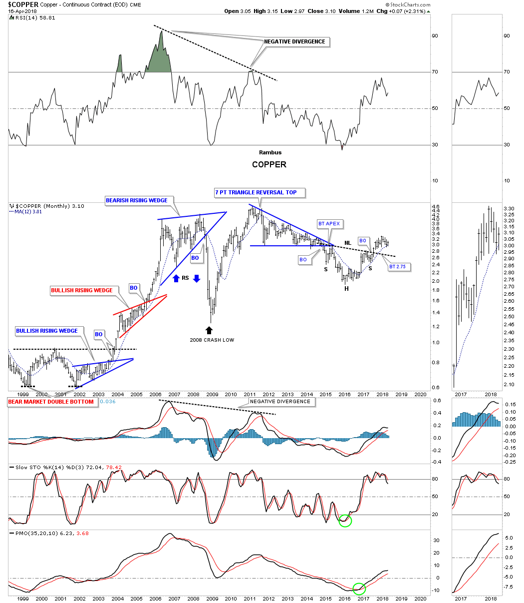
Below is a 50 year chart for Copper which shows it too had a massive base it built out over 26 years. The opening of the 26 year flat top triangle base suggested we could see a move up to the 3.81 area. Again like the CRB index and the WTIC, the top of the 26 year trading range held support during the 2008 crash. What had been resistance for 26 years turned into support which is one of the basic principles of Chartology.

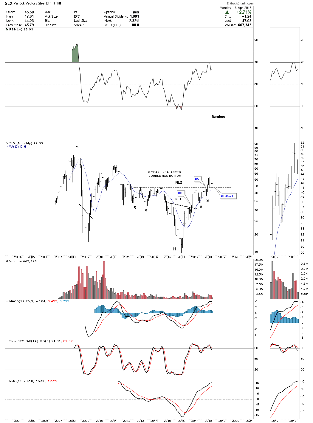
Next we have the SLX, steel etf, which has broken out from a six year unbalanced H&S bottom and is now in the process of backtesting the neckline with the 12 month ma helping with support.
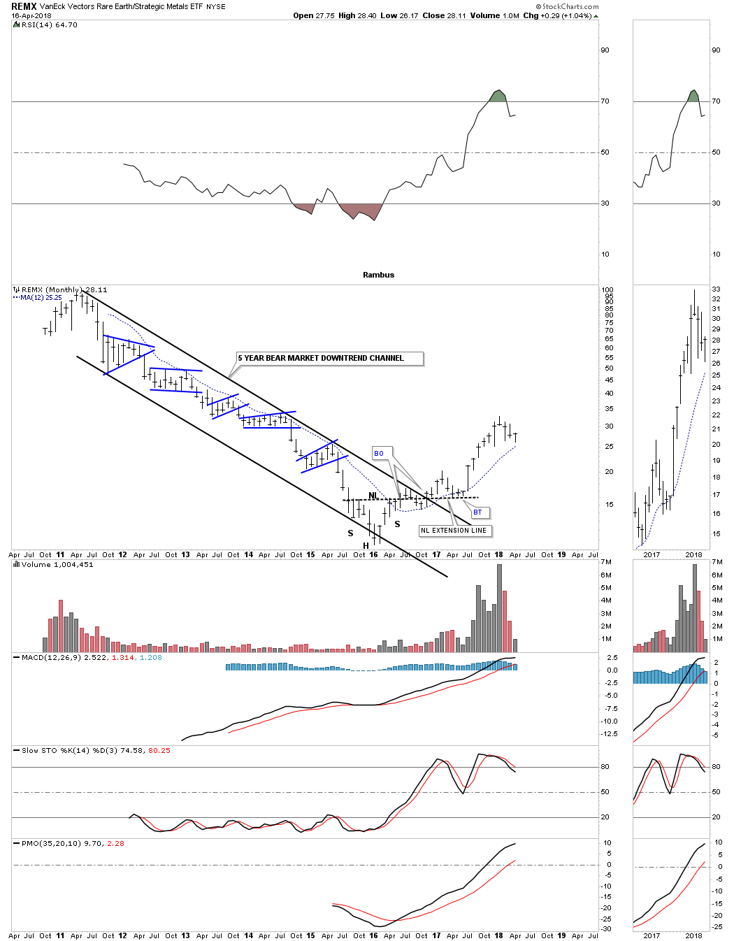
Another sector that bottomed in early 2016 was the REMX, rare earth etf, which was trapped in a five year downtrend channel. Its H&S bottom was a little sloppy, but it finally worked out and REMX has been in its own bull market ever since.
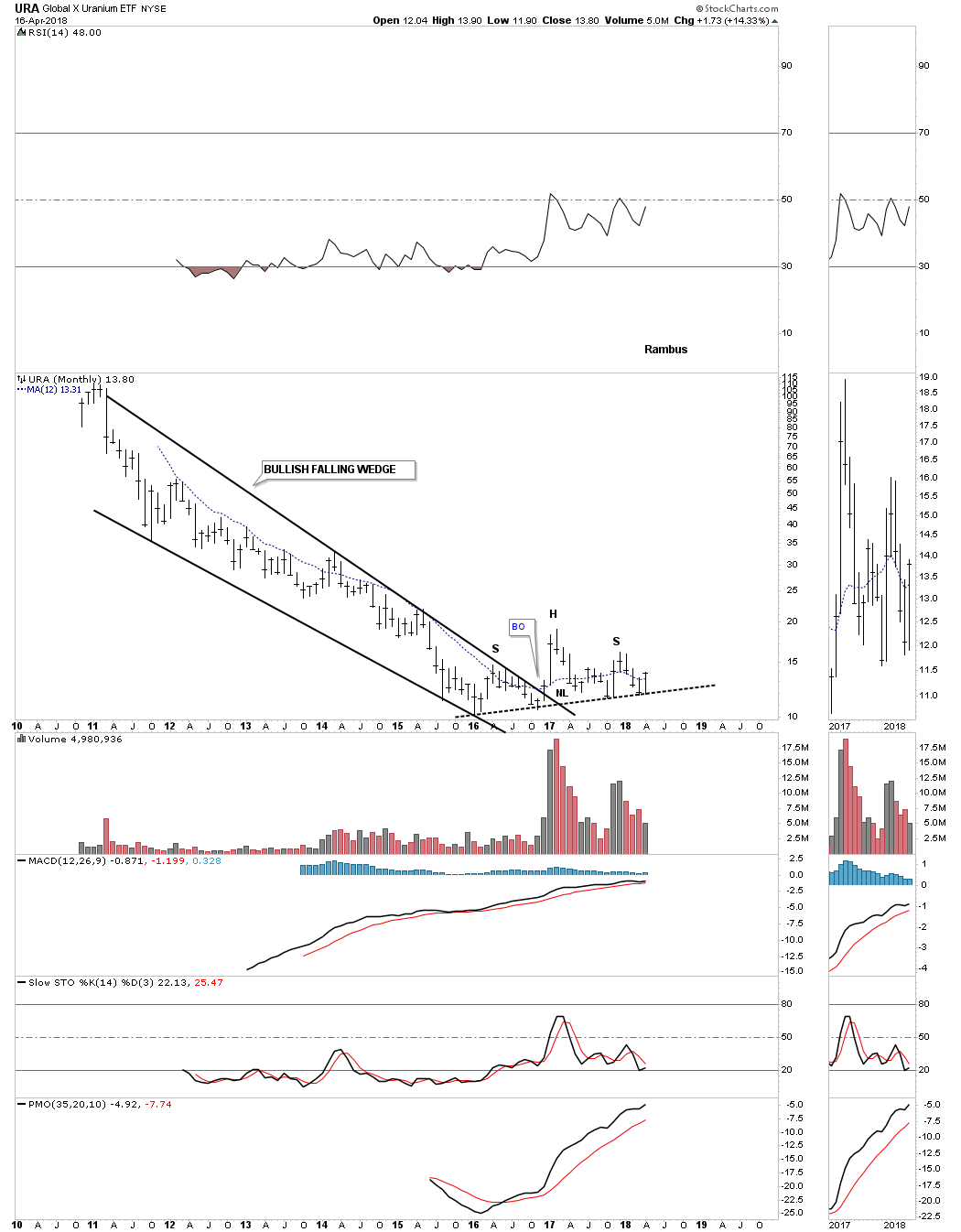
The last stock we’ll look at is the URA, Uranium etf, which was caught in a five year falling wedge formation. It finally broke out of the falling wedge in late 2016, but has been chopping sideways making little headway higher. It looks like it is forming a H&S top, but with the rest of the commodities sectors showing bullish signs I think what looks like a H&S top will be a failed H&S top. We’ll know it’s a failed H&S top when we see the price action trade above the right shoulder high. As with any failed H&S pattern you can generally expect a big move in the opposite direction, in this case up. The price action is currently trading just above the 12 month ma which is a good start.
When looking at all these charts above it appears the commodities complex has pretty much bottomed out and is starting its bull market that could last for several years. There are several large cap mining stocks that we didn’t look at that are starting to do very well. The thing to do right now is to pick your stocks in the strongest areas and try to ride the bull for all its worth, which is easier said than done. It always looks easy when you look back in hindsight, but getting positioned in the here and now is a different story that’s why having something like the 12 month moving average on your side can keep you in the game for the longer term, which is where the big profits will come unless you’re a very skilled short term trader.
It’s tough riding through the drawdowns, but if you are confident about the direction of the major trend it can be easier to hang on to your positions. The toughest part of trying to trade a bull market is when you sell your stocks thinking there is going to be a big correction which may or may not come, and then trying to buy back those positions at a cheaper price. Most of the time you pay up to get back in. Does that sound familiar? At any rate until something changes it looks like its time for the commodities complex to have its long awaited bull market. All the best…Rambus
Part 3: Odds and Ends (US Dollar, Bonds and Gold)
I would like to finish up this quarterly report by looking at some areas we haven’t covered yet like the US dollar, interest rates and gold. These are some important areas to keep a close eye on as they can affect other markets in a big way.
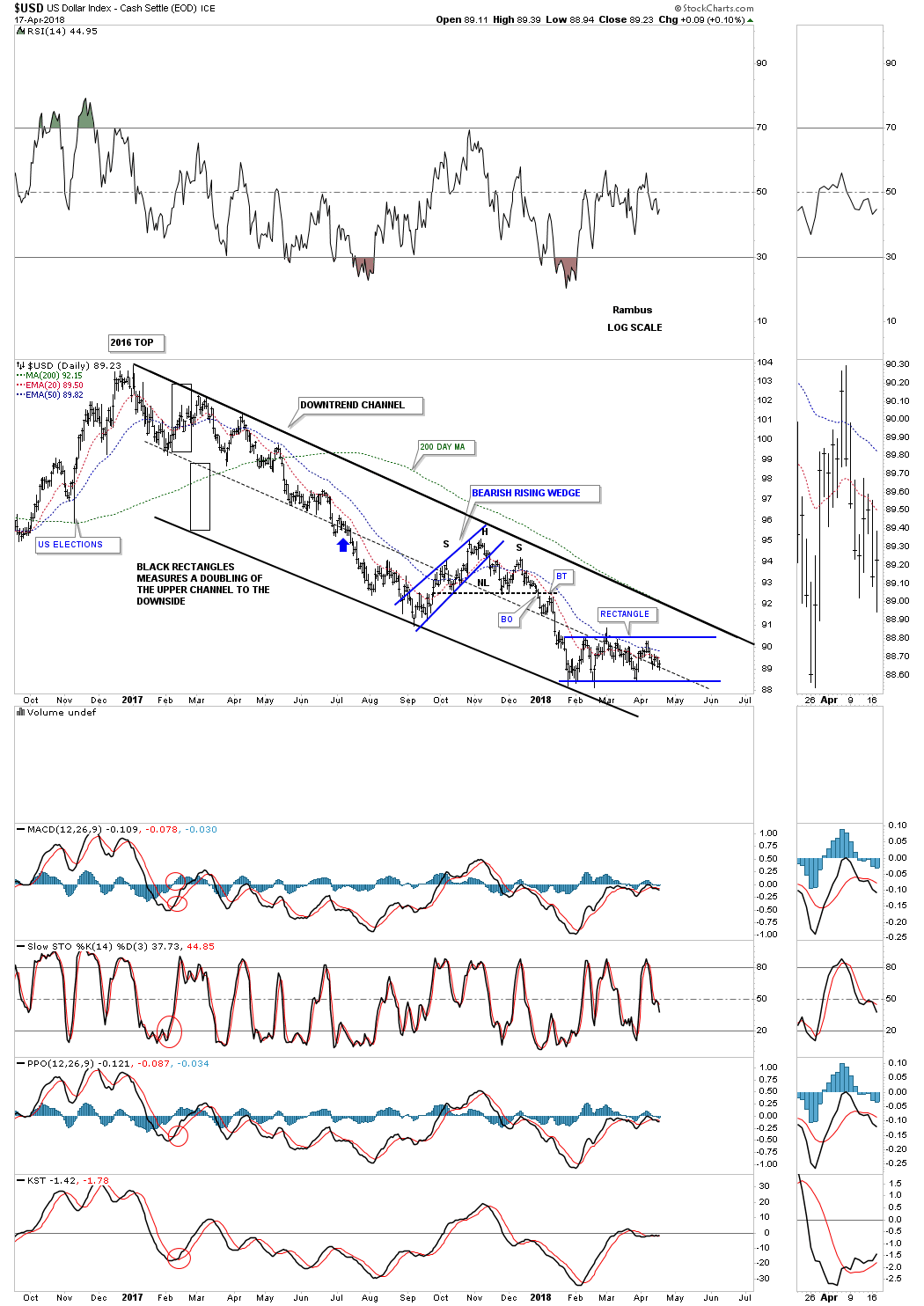
I would like to start with a short term daily chart for the US dollar which hasn’t quite made up its mind yet on what direction it wants to go. There are a lot of opinions out there on what the US dollar is going to do so I would like to offer my two cents worth on what the Chartology is suggesting.
Below is a short term daily chart which shows the US dollar has been chopping out a sideways trading range since the end of January of this year. The red circle at reversal point #4 was a false breakout which was confirmed when the price action closed back inside the rectangle. When the US dollar failed to touch the bottom rail at reversal point #5 that told me that the false breakout at reversal point #4 was a symmetrical false breakout, as shown by the red circles. If you add the distance of the false breakout above the top rail to reversal point #5, which failed to make it all the way down to the bottom rail, we would have a very clean rectangle with each reversal point being the same distance.
The H&S top that formed just above the rectangle tells us the trend is down at this point and the odds favor a downside breakout of the blue rectangle. A breakout above the top rail of the rectangle would cause the rectangle to be a reversal pattern to the upside. The bottom line is that we don’t have confirmation yet on which way the rectangle is going to breakout, which puts the US dollar in neutral territory on this short term chart.
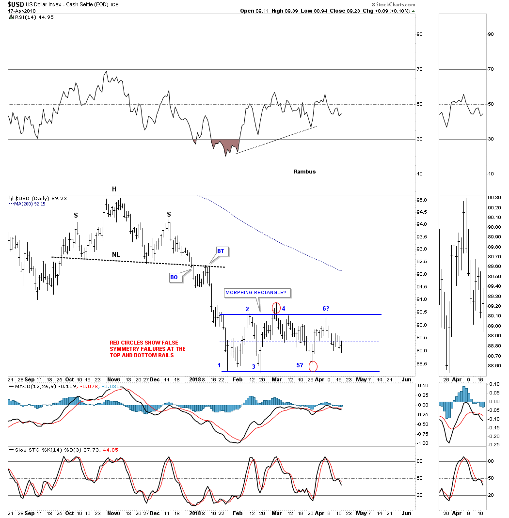
Lets step back a little further in time and look at another daily chart which puts the blue rectangle in perspective. Since the late 2016 high the US dollar has been trapped inside a downtrend channel with the rectangle forming at the bottom of the channel. It’s possible the US dollar could chop out the rectangle until the top rail of the downtrend channel is hit which would be very discouraging for both the bulls and the bears alike.
This chart also shows you a good example of how a channel can double in size which usually takes place in strong moves. The two back rectangles are the exact same size and measures price. Note the nice tight channel starting at the late 2016 high to the blue arrow. Once the price action broke below the bottom rail, which is now the mid dashed center line, I could then add the lower black rectangle to measure for a doubling of the upper trendline, which is now the bottom rail of the downtrend channel.
This next chart is a weekly combo chart which has gold on top and the US dollar on the bottom. What I was trying to show on the left hand side of the chart was the massive positive divergence the US dollar was making vs gold at the 2011 high for gold. The purple arrows show the 2008 high for gold and the low for the US dollar. Gold then went on to build out that three year 6 point bullish rising wedge which gave gold the energy it needed to reach its all time high in September of 2011. While gold was almost going parabolic into its 2011 high the US dollar actually made a higher high in 2011 vs its 2008 low. With that massive rise in gold one would have thought that the US dollar would have been in crash mode which tells us there is generally an inverse correlation, but not always. Remember the only rule when it comes to the markets is that there are no rules.
On the right hand side of the chart I originally thought the US dollar was building out a rectangle consolidation pattern that would breakout to the upside, which it did, but then turned right around and closed back inside the rectangle. When that happened I had to label the breakout as a false breakout putting the US dollar back into the neutral camp.
Now that the US dollar has broken below the bottom rail of that 2 1/2 year blue rectangle we’ll need to see confirmation the breakout isn’t a false breakout like the one above the top rail. Confirmation for me would be if we see the smaller three month rectangle that we looked at on the daily chart above, breaks out to the downside. If that were to occur we could see a pretty sharp move down, reverse symmetry, to the S&R extension line which comes into play around the 80.00 area. For the time being the US dollar is trading in no man’s land until the rectangle breaks out one way or the other.

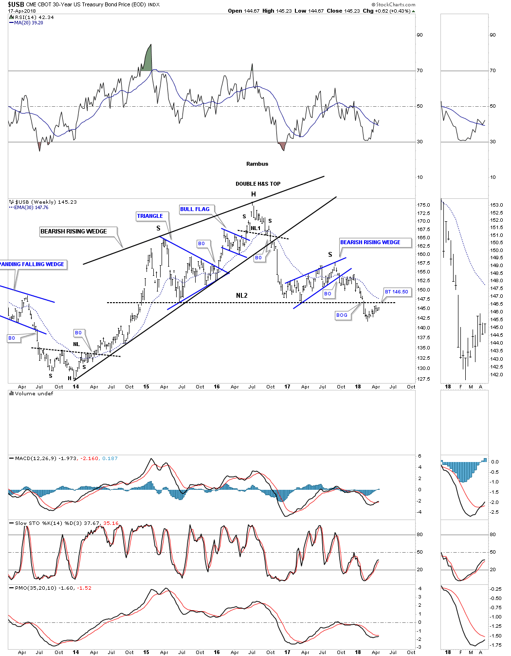
As everyone knows interest rates have been climbing lately so lets look at the USB, 30 year bond. Lets start with a five year weekly chart which shows us a little more detail than the longer monthly and quarterly charts we’ll look at next. This five year weekly chart shows that the USB had several topping patterns that ended its nearly 35 year bull market. The first reversal pattern is the 2 1/2 year bearish rising wedge. At the top of that rising wedge you can see a small H&S top that helped reverse the trend.
After the bottom rail of the black bearish rising wedge was broken to the downside the USB wasted little time in declining all the way down to the May 2015 low where it got a decent rally. That rally built out a blue bearish rising wedge which created the right shoulder of the double H&S top. Note the small breakout gap below NL2 which suggested the neckline is properly placed. For the last three months or so the USB has been in backtest mode to the underside of the neckline which comes into play around the 146.50 area.
Below is a 40 year monthly line chart for the USB which takes out some of the noise a bar chart can sometimes make. You can see how the H&S top has been forming just above the dashed mid line of its bull market uptrend channel and is attempting to backtest the neckline. Note the inverse H&S bottom which launched this bull market in bonds back in 1982. As this is such a long term chart changes come slowly, but we can see what the big picture is telling us, which is most important to understand.
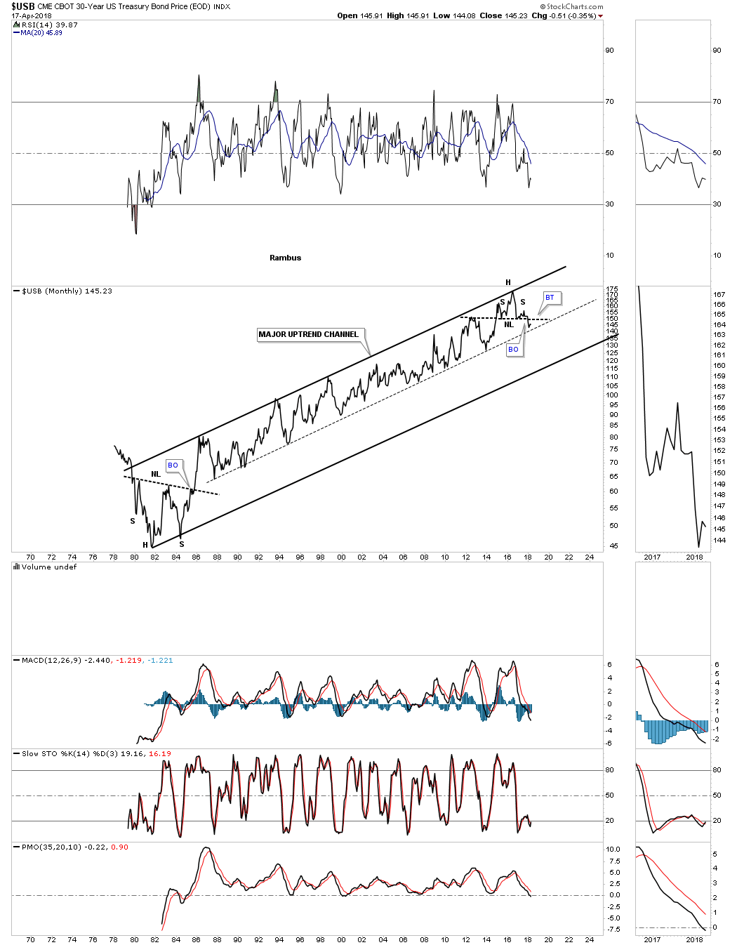
This last chart for the USB is a long term quarterly bar chart which shows you a perfect parallel uptrend channel until the false breakout above the top rail which I’ve labeled as a bull trap. Since the bull market uptrend channel had a lot of chopping action I expect the downtrend, when it starts in earnest, will look similar to the uptrend channel only in reverse. Normally when you see a strong move up with little to no consolidation patterns being built out then you can see a sharp decline over that same area. As you can see there were many tops made on the way up so they should come into play on the way down as possible initial support.

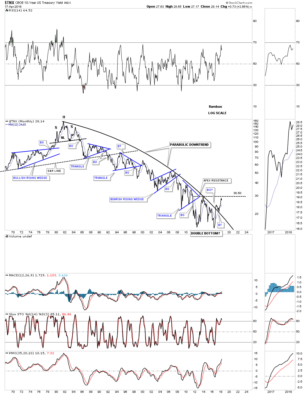
Next lets look at the TNX, ten year bond yield, that has been building out a three year H&S bottom. It broke out above the big three year neckline with a breakout gap and has been in backtest mode after a small rally. The right shoulder built out a small H&S consolidation pattern which strongly suggested the big three year neckline would be broken to the upside.

Below is a 50 year monthly line chart for the TXN which shows a massive parabolic downtrend that began in the early 1980’s and appears to be trying to put in a double bottom as its reversal pattern. There was a nice breakout and backtest to the parabolic downtrend line which I wanted to see take place to help confirm the parabolic downtrend was correct. The price action just recently made it back up to the double bottom trendline around the 30.50 area before backing off a bit. A monthly closing price above the double bottom trendline will confirm the double bottom is in place.
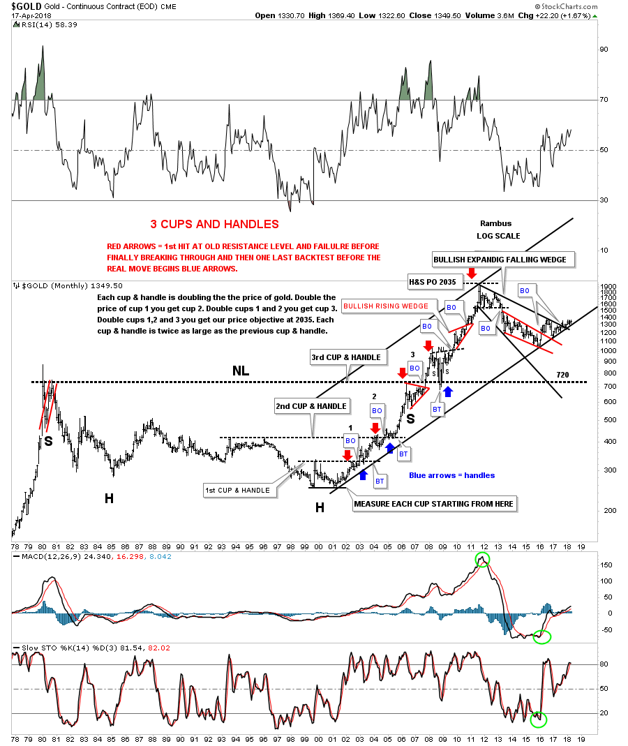
For the last three months gold had been chopping out a rectangle trading range which has completed four reversal points so far. Last Wednesday it looked like gold may breakout above the top rail but the bears stopped the advance just when it looked like the bulls were finally going to win. Note how similar this rectangle is vs the one we looked at on the daily chart for the US dollar. The big question is what direction are they going to breakout?
Many times before a rectangle is finished building out there can be one last move back down to the center of the rectangle where support is found. If the bulls are truly in charge they could take this oppurtunity to rally gold up and through the top rail to complete the rectangle as a halfway pattern. If the bulls can muster up enough energy to take out the top rail the rectangle would have a price objective up to the 1445 area as shown by the blue arrows. At this point there is no way to know if we’ll see another reversal all the way back down to the bottom of the rectangle which would complete the 5th reversal point. It’s still a consolidation pattern at this time.
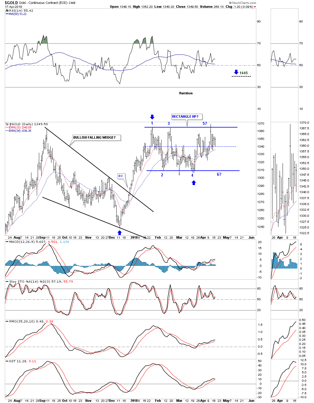
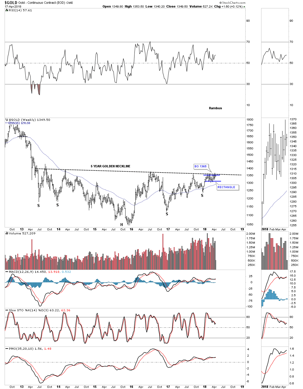
Below is a weekly line chart which shows the possible five year H&S base building out. The three month rectangle we just looked at on the daily chart above is building out just below the neckline. We’ve discussed many times in the past that it can be a bullish situation when we see a small pattern form just below an important trendline, in this case the neckline. These smaller patterns can give the energy a stock needs to finally takeout that important trendline. Gold tested the neckline again last week pushing slightly above the neckline, but the bulls were unable to hold on.
We know that neckline is very hot by the many touches it has had in the last five years. If gold is finally ready to breakout it will be interesting to see how it does it. Since there is such a well defined line in the sand we could see a big breakout gap as all the bears that have been defending that neckline are finally exhausted with none left to put up a fight. The line in the sand comes in at 1365. The breakout is so close you can almost taste it, but until the neckline gives way the bears are still in charge.
During the 2008 crash gold built out a very symmetrical H&S consolidation pattern which led to the final rally phase into the 2011 high. As you can see it took roughly four months for the breaking out and backtesting to the neckline to finally complete the pattern. It will be interesting to see what this chart looks like in six months.

Below is a 20 year monthly chart which shows how the current H&S consolidation pattern fits into the big 20 year bull market uptrend channel.
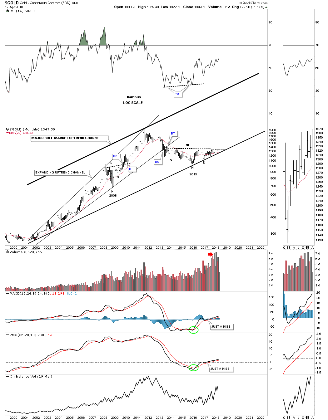
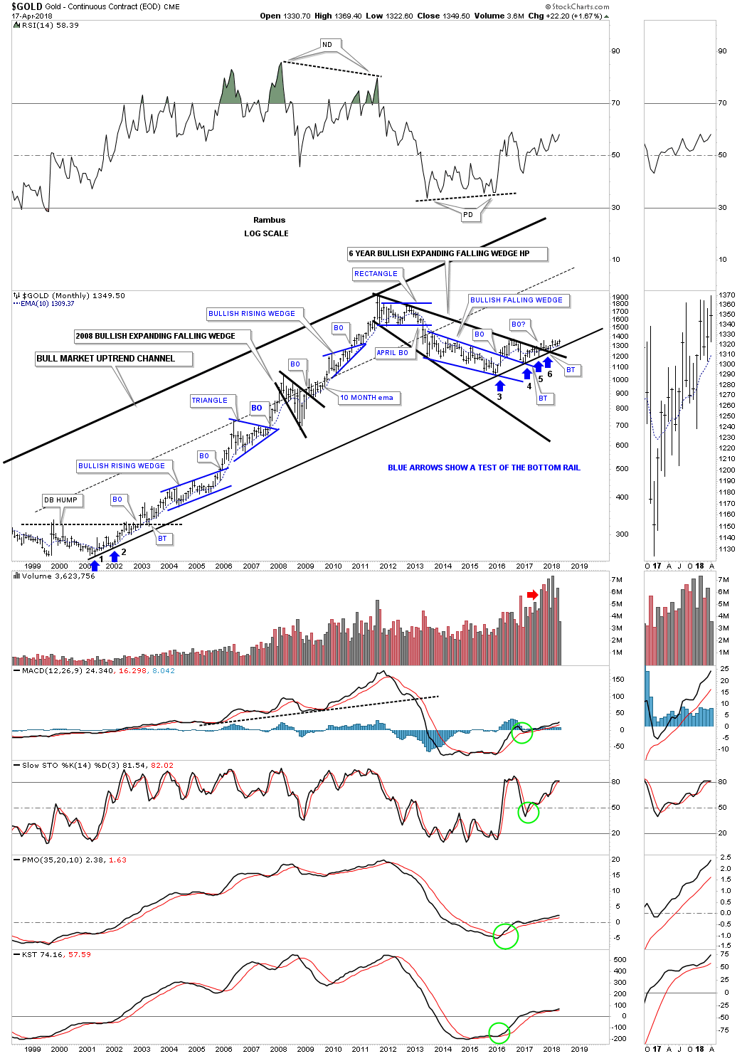
Below is another way to look at gold’s bull market uptrend channel which is my favorite long term chart. This chart shows all the consolidation patterns that formed during the first phase of gold’s bull market. Since 2011 gold has been consolidating that first phase by building out the black expanding falling wedge.
There is some really nice Chartology if you follow the price action starting at the blue arrow marked with a #3 on it. One of the reasons its taken so long for gold to really start moving up is because of all the work it has had to do with the breaking out and backtesting of all the important trendlines. Gold has been painfully climbing along the bottom rail of the major uptrend channel that has been tested six times so far, so we know it’s hot.
I don’t show it on this chart, but when the H&S neckline we looked at on the above charts gets broken to the upside, that is when we’ll see the price action start to accelerate away from the bottom rail of the major uptrend channel. I’ve always said that gold produces some of the nicest Chartology of any market sector out there. If gold was manipulated as many seem to think there is no way you would get such beautiful chart patterns.
Part 4: Post Script – SPX and GOLD Combo Chart
This last chart for gold is a 40 year monthly chart which puts the 2000 uptrend in perspective. As long as the bottom rail of the 2000 uptrend channel holds support the secular bull market remains intact.
This finishes up the Quarterly Report. I hope I was able to show you how important the big picture is to understand. If you trade long in a bull market and make a bad entry point in a trade you’ll eventually be saved. If you try to short in a bull market and make a bad entry point it can be devastating if you don’t get out in time, as the bull market will be unforgiving. The trend is your friend until it isn’t. All the best…Rambus
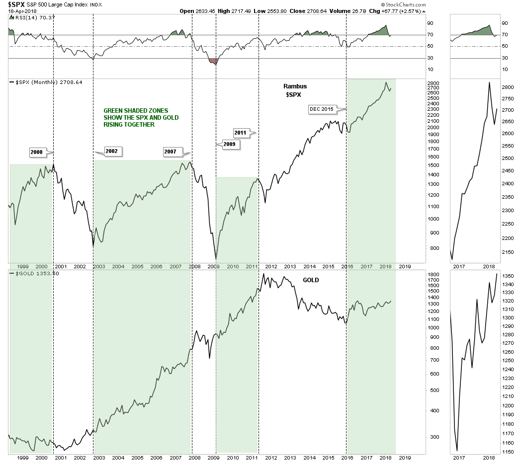
There is a misconception out there that in order for gold to have a bull market the stock markets have to crash and burn. Gold investor literally pray for the stock markets to crash so they can get their bull market in the PM complex. Once an idea like that gets embedded into the minds of gold investors it becomes hard for them to see the truth. A simple combo chart can show you the truth about why the stock markets don’t have to crash in order for gold to enjoy a bull market.
Below is a 20 year monthly combo line chart which has the SPX on top and gold on the bottom. The green shaded areas show when the SPX and GOLD both rallied at the same time. I used the rally phases in the SPX to draw in the green shaded areas to see what gold looked like.
Starting at the end of the secular bull market in 2000 for the SPX gold basically traded sideways to slightly up during the SPX’s bear market into its 2002 bear market low. From 2002 until the SPX topped out in its bull market run into the 2007 top gold rallied right along side of the SPX. How can that be? Gold isn’t supposed to have a bull market when the SPX is having one.
The SPX did top out slightly ahead of gold and had a much bigger correction than gold into 2009 crash low, but they both declined without gold producing a new bull market relative to the SPX. You can also see gold actually bottom just ahead of gold in late 2008 while the SPX bottoming out in March of 2009. For the next two years the SPX and GOLD both enjoyed a strong bull market move into the 2011 high.
Again gold topped out just after the SPX in 2011, but this time gold began its cyclical bear market while the SPX continued higher with its bull market. Gold finally bottomed in December of 2015 and from that point both the SPX and GOLD have been rising together. How long will they move up together is anybodies guess, but this combo chart suggests that we don’t have to see the stock markets crash in order for gold to have a bull market. Maybe we’ll see the best of both worlds which would be good for everyone. All the best…Rambus
Catherine Austin Fitts:
Rambus, I can’t thank you enough. Another layer of fog just got cleared out of my mind! This is another outstanding Blockbuster Chartology! We have a lot to study and digest.
Let me remind our subscribers that they can access your ongoing efforts at your outstanding website and community: http://rambus1.com.
Related Reading:
- 2017 Annual Wrap Up – Does Your Pension Fund Have A Deep State Drain? – January, 2018
- 1st Quarter Wrap Up 2018 Web Presentation
- Blockbuster Chartology with Rambus – October, 2017
- Blockbuster Chartology with Rambus – July, 2017
- Blockbuster Chartology with Rambus – May, 2017
- Blockbuster Chartology with Rambus – January, 2017
- Blockbuster Chartology with Rambus – Jan 17, 2018
- Blockbuster Chartology with Rambus – July 21, 2016
- Blockbuster Chartology with Rambus – April 21, 2016
- Rambus: Are We in a Deflationary Spiral? – January 28, 2016
- The Dollar, Gold & the S&P 500 with Rambus – October 15, 2015
Be the first to comment